blog
Blog

Home page / Blog / Category


Category: Building marking

Projektowanie w pełni zgodnych, świetnie wyglądających znaków, tabliczek z alfabetem Braille'a

Designing fully compliant, great-looking signs, braille plaques

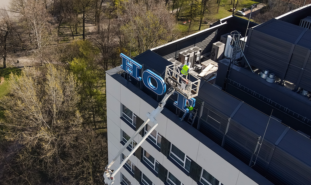
When it comes to signage, it's important to strike a balance between compliance and aesthetics. At Pretende, we specialise in designing signs, placards that are not only fully compliant but also visually appealing.


Background design gallery


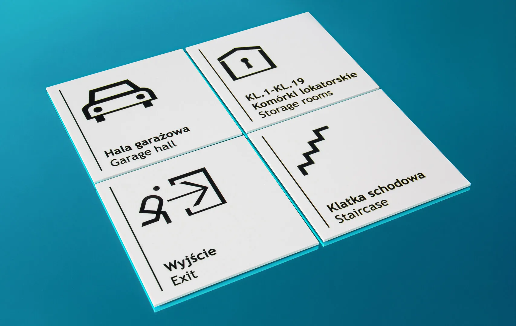
If you would like to personalise your Braille signs, we offer a background design gallery that allows you to choose from many options. This gallery includes various designs, colours, and textures that can enhance the visual appeal of the signs. By deciding a background design that matches the overall theme of your facility, together with us, you can create a cohesive and professional look for your building signage.


Custom sizing and personalisation 


In addition to the design options mentioned above, we also offer the option to customise the size of braille signs. This ensures that the sign fits perfectly in the designated area and is clearly visible to people who use Braille to navigate.
In addition, we offer the option of adding your inscription, logo, or company image to the sign. This personalisation not only adds a unique touch, but also helps to reinforce the brand identity in the workplace.


The art of designing signage, braille signs


Designing braille signage involves many considerations, our expert design team takes every factor into account. From the outset, we ensure that the graphics meet all braille signage compliance standards while maintaining an attractive appearance.


The process


Our process for creating Braille signs involves several stages to achieve the desired results: To make our signs accessible to the visually impaired, we use Braille lettering. Using a computerised drill, we make precise holes in the background of the sign. The depth of these holes is crucial and requires meticulous calibration. Once the holes have been drilled, small plastic beads are inserted using a special tool, creating a convex text in Braille.


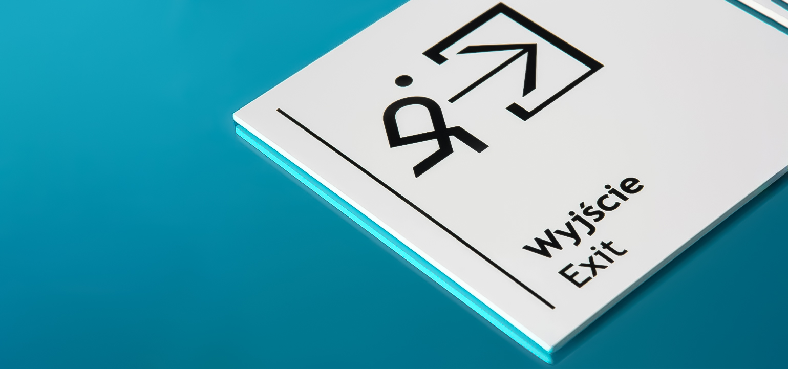
On which side of the door is the Braille signage placed?


When it comes to placing a braille sign next to a door, there are many factors to consider. The recommended location of the braille sign is on the side of the door latch where the door handle is located. This is the side where people enter the room, making it the most logical place for the sign.


To ensure accessibility for all users, it is important to allow users in wheelchairs or with different abilities to safely approach and interact with the sign without the door swinging open and causing any obstruction.


However, if there is not enough space on the latch side of the door, the sign should be placed in the nearest accessible location. It is significant to avoid placing the sign too far away from the door, as it may become disconnected and cause confusion for users trying to locate the sign.


For doors that open inwards, the sign can be placed directly on the door. This is permitted to prevent potential hazards to visually impaired users. Placing the sign on the door when it swings outwards may pose a risk of hitting the user in the face when trying to read the sign at close range.


Ensuring compliance, standardising signage for the blind


While we encourage creativity and personalisation, we understand the importance of adhering to the guidelines of specific standards for the blind. Our team of experts will work closely with you to ensure that your custom braille sign meets all requirements. This includes the correct placement and size of braille dots, the use of appropriate colours and contrasts and the inclusion of tactile elements.
By combining our expertise with your vision, we can create a custom braille sign that not only meets the needs of the visually impaired, but also enhances the accessibility and inclusivity of your facility.


Finishing


To complete the braille sign, we apply double-sided tape to the back for easy installation. The sign then undergoes a thorough cleaning and inspection before being carefully packaged for shipment.
If you have a braille sign design in mind, we are happy to help. Our team at Pretende is dedicated to creating fully compliant, visually appealing signs, braille signs that make a lasting impression on their users.
 

2023.11.29

Pretende

Oznakowanie budynków mieszkalnych - jak wykonać je ze sztuką?

SIGNAGE OF RESIDENTIAL BUILDINGS - HOW TO MAKE THEM WITH ART?

Signage of residential buildings helps you find a property quickly and efficiently but it can also be a visual and eye-catching addition. In this article you will read how to correctly mark a residential building (and not only) and how to choose the right graphic elements. Guidelines for the marking of residential buildings can be found in the geodetic and cartographic law.


SIGNAGE OF RESIDENTIAL BUILDINGS - WHY IS IT WORTH DOING IT RIGHT?
Correct marking of a residential building is a convenience not only for family or friends, but also, above all, for emergency services, when in life or health threatening situations seconds count. Clear and visible marking of the building will make it easier for an ambulance or fire brigade to find it. A well-marked property is also a landmark for third parties who get lost or need help. It is worth remembering and immediately after receiving the decision on assigning the numbering - place it on the building, according to the relevant rules.


MARKING OF RESIDENTIAL BUILDINGS - RULES
The building number along with the name of the town or street should be mounted on the front of the property from the street or access road to the building. In the event that it is located deep inside the property, the marking must also be placed on the gate or fence. Designations of residential buildings should therefore:
●    stand out from the facade (the material and colours play an important role here),
●    be legible and visible from a distance (it is worth remembering about the appropriate size of markings);
●    be visible after dark (backlight is necessary).


Informational elements are supposed to be useful above all. However, practicality should be combined with aesthetics. In accordance with the architecture, each project should be approached holistically and individually. Therefore, it is worth choosing the elements of the visual system, among others, in accordance with the architecture of the property. What will work in a block of flats will not fit in historic tenement houses. The owner of a single-family home who is responsible for only one building can choose any style of signage. However, in the case of larger projects, e.g. housing estates or modern blocks of flats, the developer should plan the marking much earlier and more carefully. Thanks to this, he can adjust them to the style and vision of the entire estate, thus increasing its aesthetics and using this element as an asset in sales.


MARKING OF RESIDENTIAL BUILDINGS AND THEIR APPEARANCEIn addition to being distinctive in the background of the real estate, all markings should be selected so that they blend in with the architecture of the building, and even with the surroundings. If the idea of a single-family housing estate is to maintain cohesion with nature, and there are wooden inserts on the facade (pillars, shutters, etc.), you can consider elements made of the same material when marking. In modern buildings, metalwork will work, and in the case of historic tenement houses, rustic building markings will fit in. The choice of materials and solutions is huge, so it's worth matching them together. In creating a project related to the visual identification of buildings, an advisor will help, who will easily select the solutions best suited to a specific case.


MARKING OF THE APARTMENTS
The owner of an apartment building should take special care of accurate and legible marking. The building number, street name or proper name must be visible from a distance, regardless of the prevailing weather conditions. It is also worth focusing on a clear internal marking. In the lobby or at the reception, it is worth finding a place to put the general name of the entire facility, and in the corridors, precisely mark the directions of movement towards individual premises. It is also important to remember to mark elevators, communication routes, evacuation routes or storeys in staircases. These are minor elements, but it is worth taking care of them since they are a great help allowing users to easily move around the building.


MARKING OF PUBLIC BUILDINGS
Public utility buildings are places that should be particularly well marked. It is hard to imagine a visit to a clinic or hospital without descriptions of offices, rooms or entrances to individual buildings. It is a necessity and facilitates the functioning of both patients and specialists. The same applies to schools, universities, banks, museums and sports facilities. Although they will consist of different rooms, it is necessary to mark all of them in a very clear and, above all, in a logical way. All information boards should be made in the same style, possibly adapted to specific buildings. You can then designate individual colour or graphic elements that, on the one hand, would be consistent with the entire project, and on the other, would perfectly indicate where the user is.


In the case of public buildings, external markings are used, i.e.:


● property number and street name,
● proper name of the property,
● markings of individual entrances
● boards informing about which rooms or offices are located in particular places.


Internal labeling applies to:
● offices and study rooms,
● reception,
● check-in desk,
● halls,
● branches,
● conference rooms,
● toilets,
● elevators
● or storeys.


What these rooms will be depends on the purpose of the building. A good solution is also the marking of ground-floor sites. They will protect users and create a more intimate atmosphere, but also inform from the outside what is in individual premises.


HOTEL SIGNAGE
Hotels and tourist facilities should be visible from a distance. In this case, it is worth focusing on distinctive signage, totems, neon signs, Led letters and other elements related to light advertising. However, hotel facilities should especially take care of an internal, consistent style suited to the character and vision of the brand. In such places, you can not forget about marking the reception, restaurants, conference rooms, rooms for guests, playrooms, spas or swimming pools. Markings should be visible and legible, and guests should be able to easily find the location they are interested in after reading them. The entire creation must also take into account the principles of fire protection and occupational health and safety.


HOW DO WE WORK?
When creating a concept for marking residential buildings, public buildings or hotels, it is important to maintain logic and consistency. Properly selected and made elements have an informative function, but they are also an interesting element that visually enriches the property. Our specialists, thanks to many years of experience, pay great attention to every detail, but they are also able to match individual elements (materials, colours, design, size) so that they form a harmonious whole. In each project we carry out, we also mark the technology in which the markings will be made, and we coordinate the entire project and its implementation. We focus on quality and creativity, because we are aware that all elements of building marking must retain their unique appearance and long-term durability as long as possible.


2023.02.14

Pretende