blog

Tag: Retro

Amerykański styl w reklamie - czym się wyróżnia i jak go wykorzystać w promocji firmy?

American style in advertising - what makes it stand out and how to use it to promote the company?

Flashy, colourful neon lights, symbols, and eye-catching bright graphic elements - these are the distinguishing features of the American style, which reigned in the United States in the 1950s. It was an expression of fascination with the future and the cosmos, as well as a reflection of the positive mood prevailing at the time. And although this enthusiastic era has long passed, the American style still fascinates and finds itself well in the advertising market.

Undoubtedly, if we want to stand out from the competition, it is a style that is worth being inspired by and used to promote the brand. Especially if you belong to people who focus on individualism, and courage and creativity are their middle names.


American-style light advertising - where does the idea come from?


The style in question is a combination of flashiness, colours and shapes that attract attention from a distance. That was the purpose of mid-twentieth-century American signs. They invited people to roadside bars, restaurants, and motels. They indicated specific points with large arrows, symbols, and lights. They surprised with their futuristic appearance, but on the other hand, they blended in perfectly with the so-called Googie architecture. If you are looking for references in culture, the second part of the movie "Back to the Future" can be mentioned, in which the main character goes back in time to a town full of neon lights and enjoys a classic "milkshake" in a pastel bar. From fairy-tale references, "The Jetsons" fit perfectly into this style, delighting with a futuristic vision of a city in the clouds. It is a style that was ahead of its time, attracted attention and allowed breaking the standards prevailing at that time. Today, it is being rediscovered in various industries, partly due to its uniqueness, but also due to fascination with the vintage trend.


American style in a modern edition


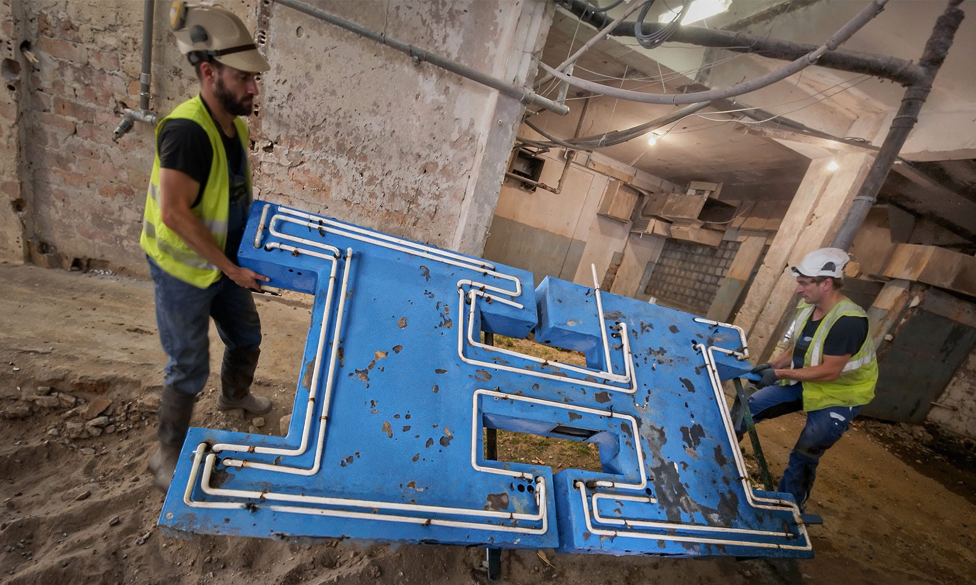
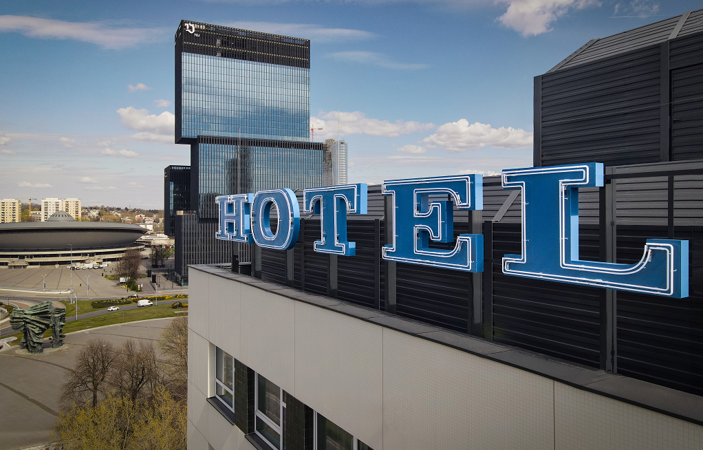
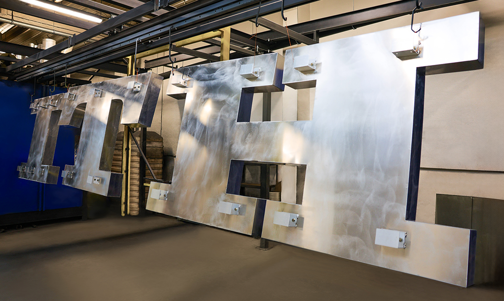
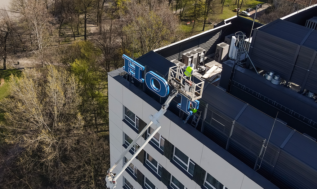
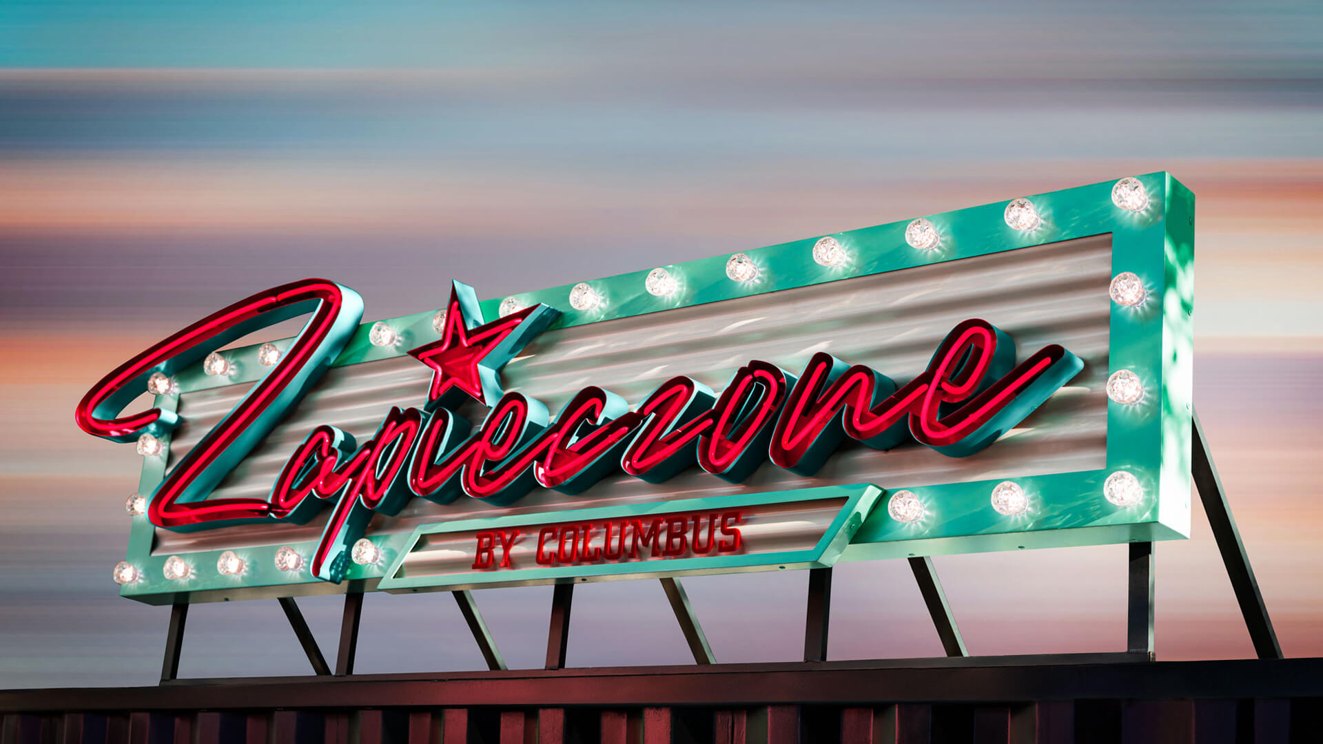
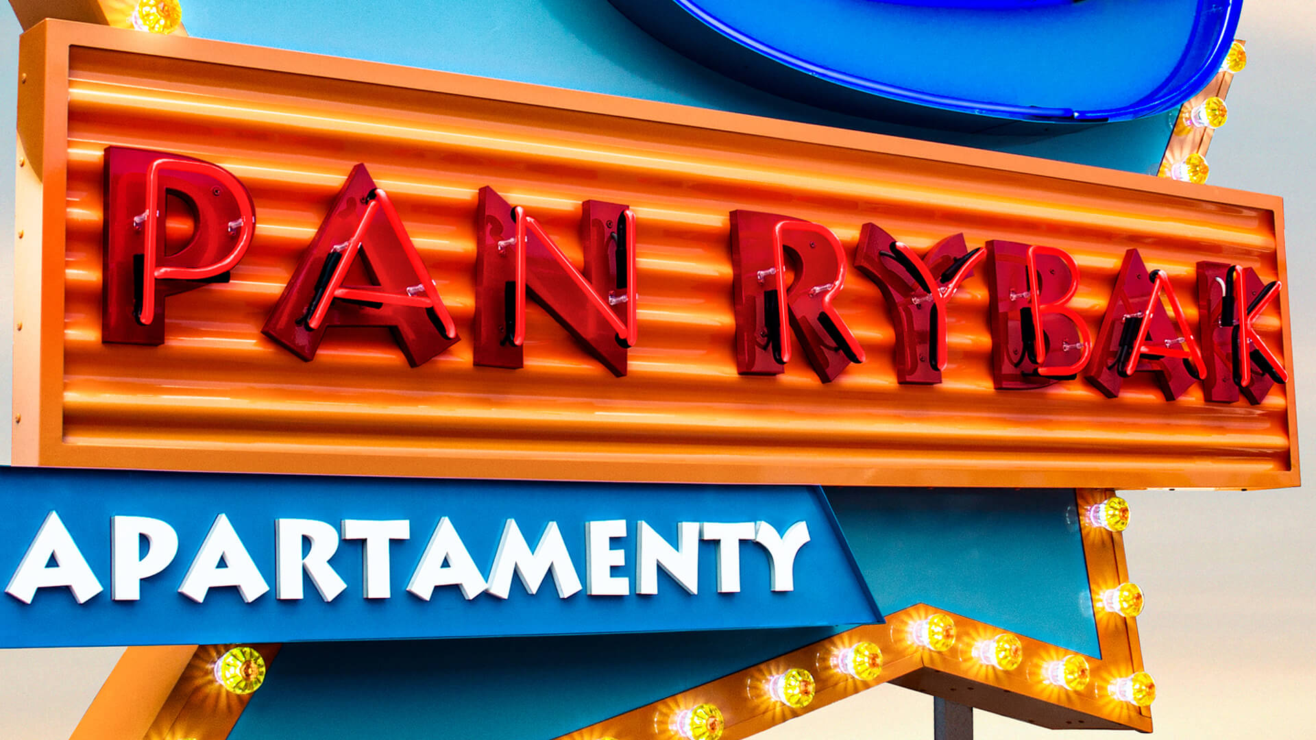
Although it seems that the American style is glamorous and exaggerated, it undoubtedly attracts attention. In our projects, we get the best out of it, we inspire ourselves and adapt it to the client's visual identification. This style is characterized by its individuality, influenced by the fact that our first designs are always made by hand, and we have launched a new, special production line to create these non-standard signs. Thanks to this, we are the only company in Europe that specializes in creating creative advertising in the American style.


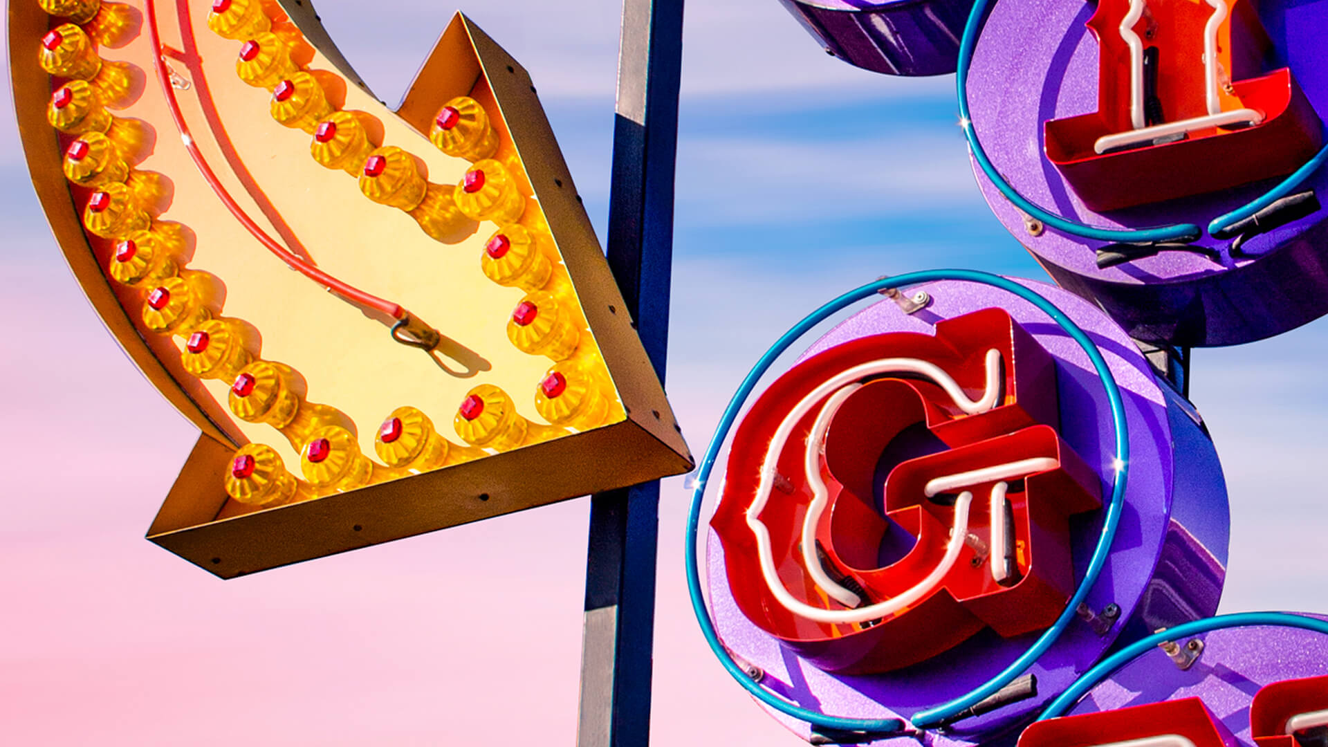
What distinguishes the American style in light advertising?


In this light advertisement, there is no talk of minimalism and simplicity. Here, a multitude of well-matched elements stands out, distinguishing and complementing each other. Therefore, we can find:

  • colour - bright colors, clear, but often combined with pastels,
  • graphic symbols - arrows, geometric shapes, stars, hands pointing in the direction,
  • light bulbs - like in wardrobes from old movies,
  • neons - created from glass curls shaping into names, phrases, or slogans,
  • forms and shapes - flat surfaces, wavy, transparency, or colored metal bases of letters and symbols.

Without a doubt, a lot happens on these signs, just like in the brands they represent.


Down with minimalism - we will find a golden mean


The secret of a good American-style light advertisement is matching it perfectly to the surrounding space and finding the golden mean in its design. Therefore, as with every project, talking to our advisor is essential. Any abstraction and excess can be framed, and our technology allows us to create various ideas of our clients and create their own American Dream.

2022.12.16

Pretende

Litery metalowe, reklamy z metalu, zardzewiała blacha

Metal letters, metal advertisements, rusty sheet metal

Korten steel letters, metal letters have an antique, rusty look. Raw steel letters or hot rolled steel letters, completely rusty steel letters have a natural appearance. They will rust over time if left outside. We are pioneers in making rusty steel letters. Our precise waterjet cutting technology will give you the exact shapes and patterns you need, with the faded look of antique rusty steel. They have been used in many architectural applications in indoor and outdoor office buildings in retail stores, and wherever a rustic, industrial antique look is desired. Rusty letters filled with neon glass, installed at Alior Bank's headquarters in the recruitment training centre section.

Rusty neon letters can be mounted on any wall surface, on interior drywall, exterior brick, stone, metal stucco using studs on the back of the letters. All our metal letters come with an installation template that shows where to drill the holes.

2019.05.24

Pretende

Dekoracja wewnętrzna – Neon Rocotillo

Interior decoration - Neon Rocotillo

One of our recent projects was the implementation of lighting decorations for the newly established Rocotillo restaurant, located in the largest business and office centre in the Tri-City.

For the purposes of the arrangement, we made a coffer with retro-style light bulbs and an aquamarine neon beautifully matching the interesting interior design of the restaurant.

2019.05.24

Pretende

Litery z żarówkami, vintage broadway marquee

Letters with bulbs, vintage broadway marquee

Vintage Metal – Marquee letters

Our classic Letters with bulbs are very eye-catching. A letter filled with light bulbs - plug and that's it. Create your favourite words, phrases or monograms. The letters are available in the vintage version, the letters can be finished in any colour. You can also combine more letters from the supplied cable. The letters have bulbs of the size E14. Letters with light bulbs perfectly decorate every home and also serve as a sign of your company or a shop for commercial purposes.

Coloured lampshades for light bulbs add charm to the whole letter. The lampshades have a large selection of colours, which allows for various configurations of filling the letter. Moreover, they can be adapted to the colour of the logo. The letters in your logo can be filled with light bulbs and then coloured lampshades can be screwed onto them.

2019.05.24

Pretende

LED Neons: Acrylic LED Neon VS Flex LED Neon

Classic glass neon signs – gas-filled, full of noble nostalgia and characteristic light – have ruled the streets for years. They still impress with their charm. But the world changes, and so do our needs. Not everyone can afford the delicacy of a glass tube, especially in lively spaces like food trucks, festivals, or dynamic retail and hospitality settings. In such places, we start looking for alternatives. That’s how LED neons were born – durable, flexible, and just as eye-catching.

But “LED neon” is too broad a term today. In reality, we are talking about two entirely different worlds: acrylic LED neons and flex LED neons. Although they may look similar at first glance, the difference in craftsmanship, durability, and aesthetics is vast and hard to ignore.

How are they made?


Acrylic LED neons use an impressive technology: we start by precisely milling shapes from acrylic – letters, icons, symbols, even the tiniest details. Then we fill them with LED light – high quality, even, soft. The result? Perfectly clean edges, depth, and precise project reproduction. You can also choose where the light goes – front, side, back, or all around. Play with color – RGB, RGBW, transitions, halo effects. This gives the designer full control.

And flex neon? Well, it’s simply a flexible LED strip embedded in silicone. Its only real advantage – you can bend and install it quickly. But only if you don’t expect much. The strip can’t handle tight curves or fine details and always ends up simplified. It looks bulkier, less precise, and with less “wow.” As a commercial neon – flex doesn’t hold up in daylight (literally or figuratively). In professional spaces, it just looks cheap.

Durability and light quality: a gap between technologies


The acrylic neon’s strength lies in accurate shapes – refined, clean-cut letters and symbols. Durability? Unmatched. Acrylic resists impacts, doesn’t break like glass, and – importantly – it’s not flexible like flex. Its rigidity is a major advantage: acrylic neon is solid, stable, and doesn’t bend or deform under temperature changes.

Acrylic also acts as a light diffuser. This means letters and logos are illuminated smoothly and evenly – easy on the eyes. The light is soft and natural – comfortable even at close range.

Flex neons are the opposite. The silicone used doesn’t diffuse light evenly – especially blue tones become harsh and irritating. It strains the eyes and ruins the visual appeal.

What’s more, flex neon is unreliable – it’s made from cheap roll LED strips. Connections short, LEDs burn out. White flex turns pink, then dies. Dark spots appear – ugly up close.

From afar? Still bad – the glow is harsh and artificial, letters blur together, readability drops.

End result: what makes the difference


Acrylic LED neons simply look professional. With flame-polished surfaces, they shine and feel refined. The result is premium – evoking both elegant glass neon and luxurious 3D lettering. A branding upgrade.

Flex? Just a bent tube – often cut with a knife, glued by hand, full of imperfections. Far from professional. Not suitable for premium projects. Doesn’t inspire.

To sum up: not every glowing line is a neon


Sure, LED neon tape has its place – it’s cheap, quick, and decorative. But if you want more – quality, durability, standout aesthetics – acrylic LED neons have no rival.

This is next-gen lighting: combining modern tech with elegance. If you want your space to truly stand out – choose the solution that deserves it.

2025.07.17

PRETENDE