Tag: Corporate Identity

What are brand emblems and why top companies use metal signatures

In the world of premium brands, there is an unwritten rule: products that matter are signed. That signature is a brand emblem or a metal signature. It is a small element made of metal, often chrome-plated, polished or enamelled, which appears on a product, in architecture or within a brand environment.

It is not advertising or a graphic. It is a physical mark of quality that says one thing: this product has an author. That is why the best companies in the world use metal brand signatures — as a durable and elegant way to sign their products, projects and spaces.

Brand emblem – a physical form of visual identity

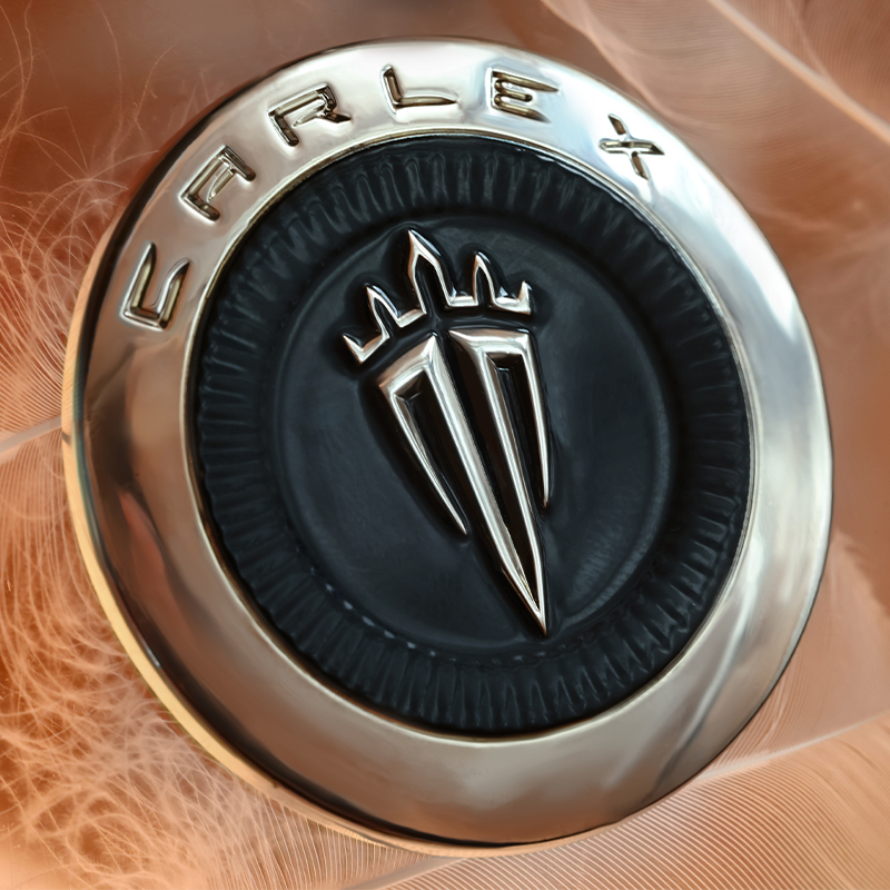
A brand emblem is a spatial marking most often made of metal or metal alloys that presents the company’s mark as a durable physical element.

Unlike printing or graphics, an emblem has structure, material and depth. Thanks to this, the brand mark stops being just an image and becomes a real object that can be seen, touched and remembered.

This is why emblems are often used in places where a brand wants to communicate quality through detail:

– on products
– on devices
– in building architecture
– in interior signage
– in equipment elements

In such projects, the emblem acts as a permanent element of visual identification that remains clear for years of use.

3D metal emblem with precise detail

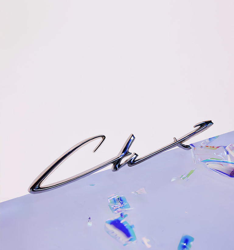
Metal signature – a subtle brand signature

A metal signature is a special type of emblem. Its role is not to dominate the space but to sign a product or project in a subtle yet unmistakable way.

Just as an architect signs a building and a designer signs their project, premium brands use metal signatures as a mark of authenticity.

Most often these are small elements placed in discreet locations:

– on a product housing
– on a metal plate
– on an architectural structure
– in the corner of a piece of furniture or installation

Their size is small, but their importance in the perception of the brand is very large.

A well-designed signature communicates quality of workmanship, authenticity of the product, attention to detail and the presence of the brand in space.

Subtle metal brand signature on a product

Why the best companies use metal signatures

The best brands in the world know that trust is built through detail. That is why, instead of relying only on advertising, they invest in elements that strengthen the perception of quality in the real world. Metal emblems and signatures are one of those elements.

Durability
Metal markings are much more resistant than prints or stickers. They do not wear off, fade or lose their appearance for many years of use.

A material associated with quality
Metal has long been associated with durability, solidity and precision. Polished or chrome-plated surfaces give the marking an elegant and professional character.

Readability in space
3D emblems have depth and structure, which makes the brand mark readable in various lighting conditions.

Subtle branding
The best brands do not need to shout their logo. Often a small metal signature is enough to highlight the quality of a product or project.

Premium metal emblem with a polished surface

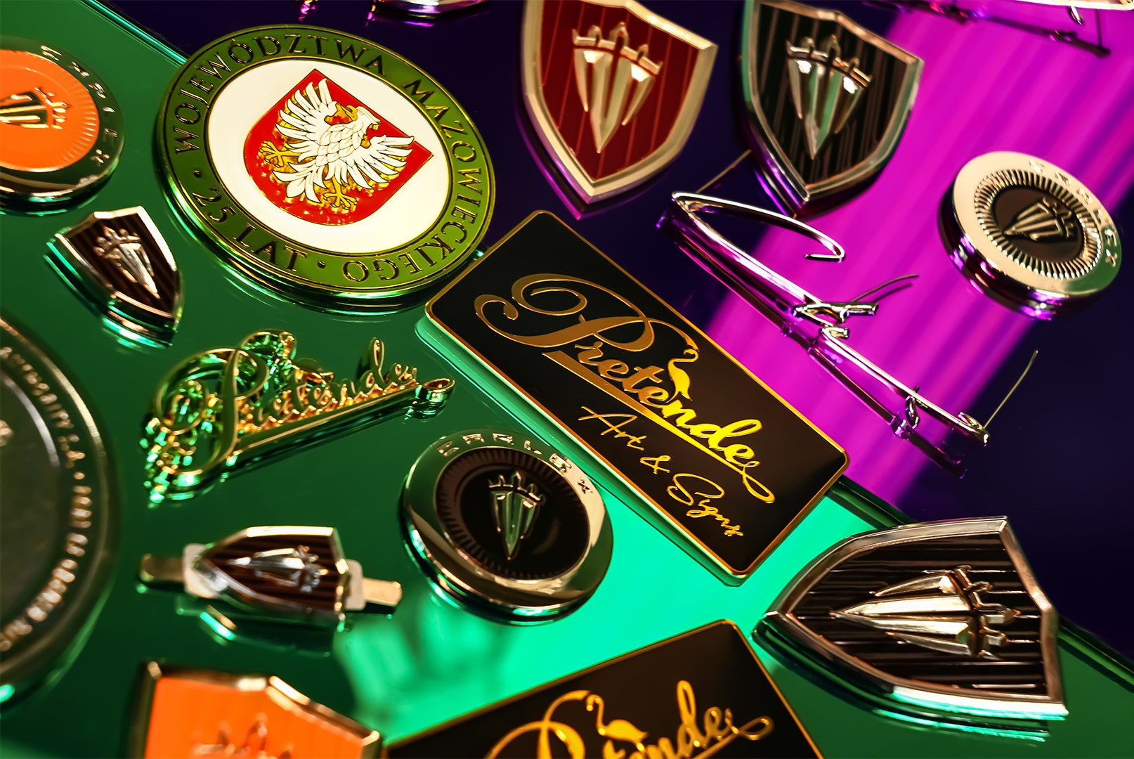
Materials used in metal emblems

Professional emblems are designed with durability and precision in mind. One of the materials often used in this type of production is zinc alloy, which allows extremely accurate reproduction of detail and form geometry.

Thanks to this it is possible to achieve:

– sharp edges
– precise spatial forms
– structural stability
– production repeatability

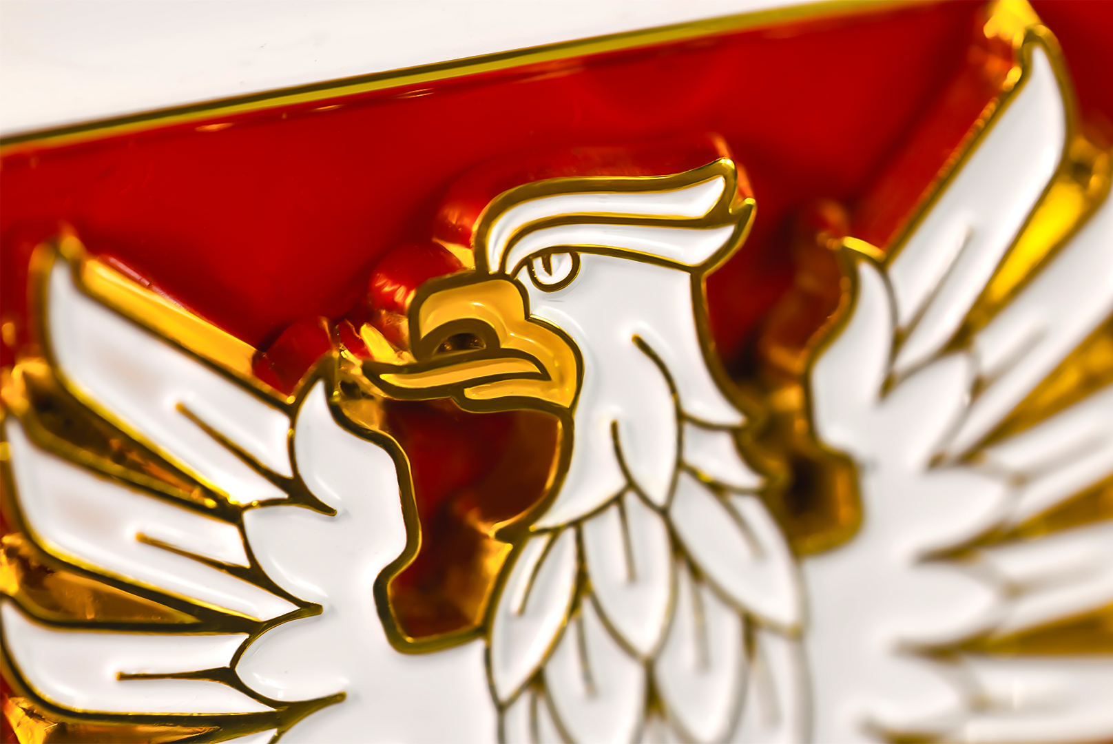
Depending on the project, emblems may be finished in various surface variants:

– polished
– satin
– matte
– chrome-plated
– gold-plated
– enamelled with colours

Such finishes allow depth, contrast and an elegant character of the marking to be achieved.

Various finishes of metal brand emblems

Emblem as part of brand strategy

In many projects the emblem plays a role much greater than simply marking a product. It becomes an element of the brand’s visual strategy.

A well-designed signature can appear in many places simultaneously:

– on products
– on architectural elements
– on space signage
– on equipment elements
– on commemorative materials

Thanks to this, the brand builds a consistent visual identification system that is recognisable in different contexts.

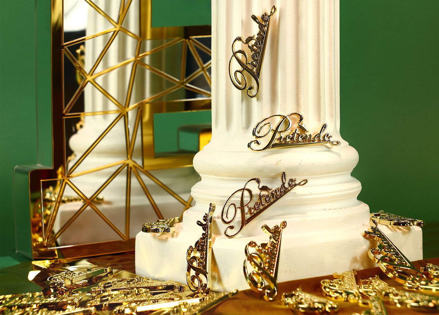
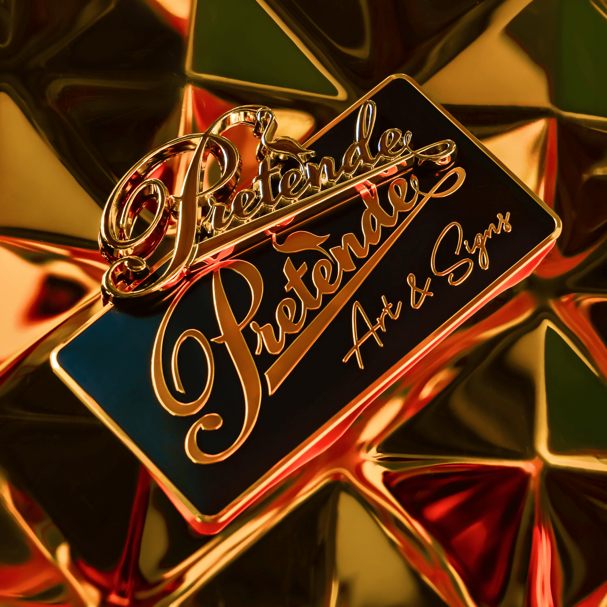
Emblems and signatures designed for brands

At PRETENDE, emblems and metal signatures are designed as individual elements of visual identification. Each project is created from scratch — taking into account the character of the brand, the proportions of the form and the place of exposure.

The process includes:

– analysis of visual identity
– spatial form design
– selection of materials and finishes
– preparation of production documentation
– quality control of execution

This approach allows the creation of 3D metal emblems that maintain aesthetics, durability and readability over a long period of use.

Production of metal brand emblems

Why detail determines brand perception

In the world of premium brands, the most important things are often not the biggest ones. The greatest importance lies in elements that are refined. Emblems and metal signatures belong precisely to such details. They do not dominate the space and do not attract attention through aggressive form.

But when someone notices them, it immediately becomes clear that the brand has been designed consciously. And that is exactly why in many industries the metal signature has become a standard of quality used by the best brands.

Metal brand detail as a subtle product signature

2026.03.16

PRETENDE

Building signage system (wayfinding) - how to design it to work in practice.

In many projects, signage is created as a collection of individual elements—boards, arrows, numbers, or logos. Each of them is designed separately, often by different people and at different stages of the investment. In the end, everything is assembled and installed in the space. From a design perspective, everything seems correct. The problem only begins when the user has to make their first decision.

A building signage system is not a set of elements. It is an information structure that should guide the user through the space without stopping them or forcing interpretation. The moment a person has to stop and think, the system stops working.

Movement through a building is based on simple decisions

The user does not analyze signage as a whole. They enter the building, look around, and search for the simplest path. They do not read every message, do not memorize information in advance, and do not build a mental map of the space. They make decisions at specific moments—where to go, whether to turn, whether they are on the right path.

If the space does not provide a clear answer exactly at that moment, the user stops. They start looking for confirmation, scanning the surroundings, going back. If the user has to stop, the signage is no longer working—it is only pretending to work.

signage – signage

Where chaos in signage comes from

Chaos does not result from a single mistake. It appears when signage is not treated as a system, but as a set of elements.

Most often, it comes from recurring patterns:

1. Signage designed at the end of the project
Instead of being part of the building concept, it tries to adapt to a finished space and its limitations.

2. Lack of analysis of user movement
The system does not respond to real behaviors, only to design assumptions.

3. Lack of identification of decision points
Information appears in random places, not where the user actually needs to choose a direction.

4. Lack of information hierarchy
All messages have similar weight, forcing the user to decide what is important.

5. Lack of system structure
Each element works individually, but they do not create a continuous guidance flow.

6. No connection with architecture
If signage does not result from the space, the user stops trusting it and relies on intuition.

7. Separation of design, production, and implementation
Each stage is handled separately, and overall consistency becomes no one’s responsibility.

8. No preparation for change
Over time, additional boards, corrections, and notes appear. The system grows, but does not become clearer.

In each of these cases, the result is the same—the user is left alone with a decision they should not have to make. And that means the problem has not been solved, only shifted onto the user, the building manager, or the operational team. In practice, it returns as user questions, additional signage, post-installation corrections, and time spent by teams explaining the space instead of using it. That is the real cost of signage that was “correct on paper.”

signage – signage

Signage as a system, not a collection of elements

Signage works only when it simplifies movement through space. It should not attract attention, but be obvious in use. A well-designed system does not require explanation. The user should not feel that they are using signage—they should feel that they simply know where to go. It is not individual boards that determine quality, but whether the whole works as one system.

Well-designed signage does not require management. Poorly designed signage becomes a constant operational problem. This is the moment when signage stops being an element of equipment and starts affecting how the entire building functions.

How to design signage that actually works

At the beginning, it is necessary to understand the space—its layout, movement directions, entry and exit points, and the moments where users make decisions. Based on this, the system logic is built: what the user needs to know, at what moment, and in what form.

Only then are the specific elements created. The system is defined much earlier—at the decision stage, not production. And this is the moment that is most often skipped in projects. That is why signage so often requires later corrections.

signage – signage

One responsibility instead of multiple contractors

In practice, the biggest problem is not design or production individually. The problem is their separation. When responsibility is divided, the problem does not disappear—it only changes ownership. The designer finishes at the concept stage. The contractor executes what they receive. Installation adapts to on-site conditions. And the system as a whole stops being anyone’s responsibility.

That is why signage is not something that can be effectively compared through quotes. Because what is being purchased is not boards—it is the way the space works. In projects that are meant to function, responsibility is not divided into stages. It is closed within one process—from decision, through design and technology, to production and installation. This ensures that signage does not require later “management”—it simply works. And that is exactly what determines whether the issue is closed or keeps coming back.

signage – signage

2026.04.02

PRETENDE

STAY
WITH US

JOIN PRETENDE INSIDER

Information on projects available exclusively to the PRETENDE Insider group - in advance of the market.