Tag: Implementation

The Rust Myth – Why Large-Format Corten Letters Are Truly Unique?

At first glance, corten steel may look like ordinary metal covered with rust. This is only an illusion — corten creates its own natural shield: patina. This variable and unique layer makes large-format corten letters and oversized corten signage one of a kind, perfectly suited for marking buildings, hotels, restaurants, and public spaces.


A patina that tells a story

Each 3D corten letter has a unique surface pattern — from golden tones, through intense rust-red, to deep brown. It is not paint but a long-lasting process that develops over time. That is why monumental corten letters are never copies, but original works created by both nature and architecture.


Rust? Or protection?

The word “rust” usually suggests decay. With corten, it’s the opposite — the patina acts as a natural protective layer. That is why large-format corten letters not only maintain their durability but also gain depth and character, making them a perfect choice for XXL signage and decorative letters in urban spaces.


Why choose corten letters?

The evolving appearance goes hand in hand with timeless form. Every project is unique, and its expressiveness grows with age. It’s a solution that cannot be ignored, practical and resistant to weather conditions.


Corten as a symbol of place

Large-format corten steel letters are more than just signs. They are architectural accents that build the identity of a space — from facades and entrances to squares and courtyards. Their strength lies in natural variability: they never look the same and mature together with their surroundings.


Large-format corten letters combine the durability of steel with the beauty of natural patina. They are not only signage but also art in public space — unique, noble, and memorable.

If you are looking for a solution that emphasizes the character of a place, attracts attention, and evolves with architecture — corten letters are an absolutely exceptional choice.

2025.10.02

PRETENDE

Hotel Katowice – the return of the iconic neon in a new form

The Hotel Katowice neon was never just an ordinary sign. It was a symbol of an era — the characteristic blue glow above the city center and a visual element of the city’s identity that accompanied residents for decades. When the time came to revitalize the entire building, the investor faced a key decision: how to bring back a neon that everyone remembered, yet one that could no longer be restored? That was the moment when the Pretende team stepped in.


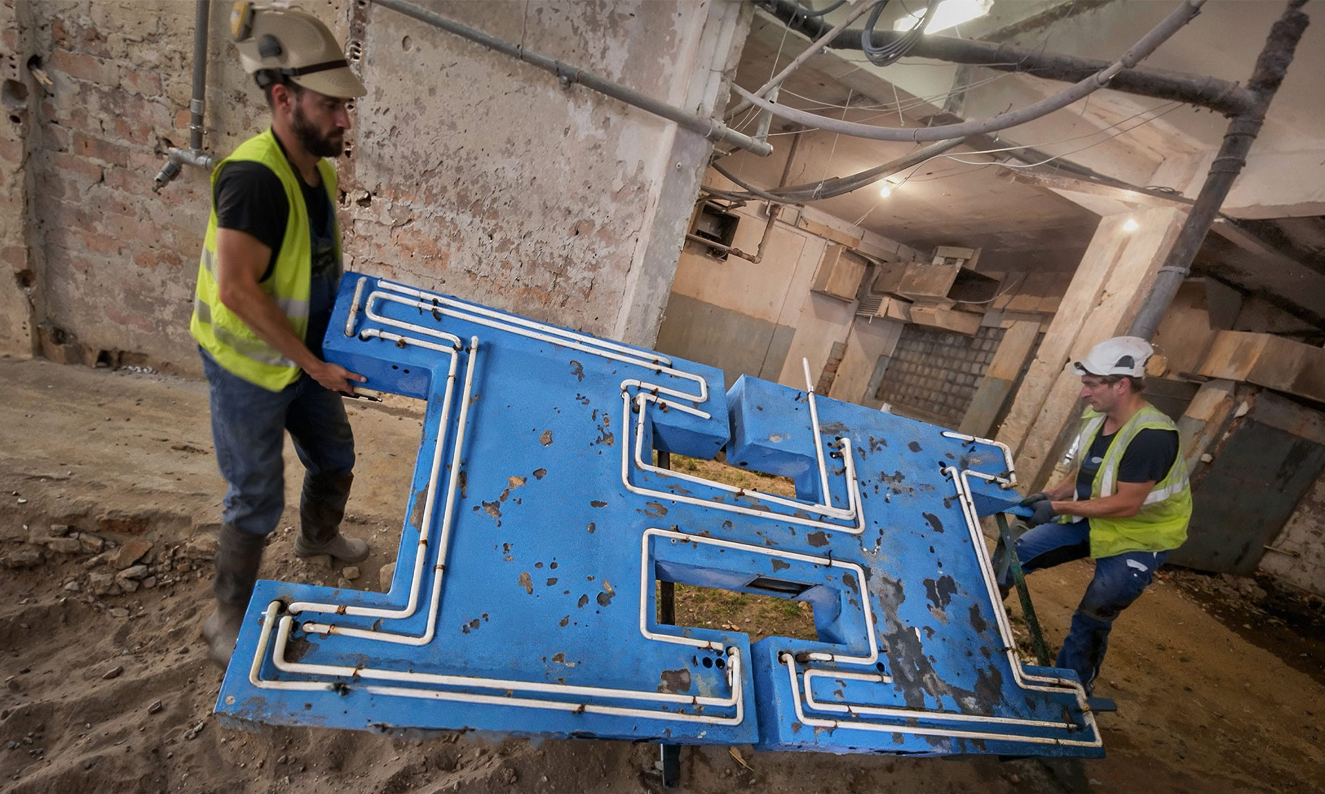
Appearance of the old Hotel Katowice neon sign before dismantling

When history meets reality


Despite its cultural value, the old neon had no chance of a second life. The metal sheeting crumbled in our hands, the structure was eaten by rust, and the glass tubes were cracked and incomplete. Technically, it was impossible to save it in a way that would meet modern safety standards and deliver the quality expected by the investor.

This was not meant to be a simple renovation. It was about preserving the spirit of Katowice. That’s why we decided to recreate the structure from scratch — maintaining full fidelity to the original, centimeter by centimeter.


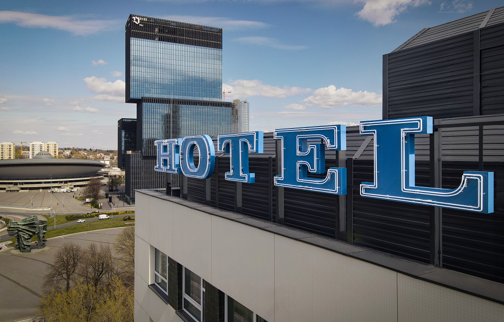
Newly recreated Hotel Katowice neon installed on the rooftop

Recreation in a 1:1 scale


In Pretende’s workshops and laboratories, a neon was created that is both new and deeply familiar to all residents. Every letter was reproduced exactly as in the original — preserving proportions, angles, characteristic curves, and the routing of the neon glass along the outline.

The color was crucial. The iconic blue shade that lit up the Katowice skyline for decades was recreated through a digital pigment analysis. The result? A blue tone that looks exactly like it used to — only clearer and more saturated.


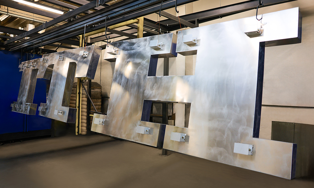
New construction of HOTEL KATOWICE neon letters during production

Modern materials, classic soul


Although the visual effect recalls the past, the new structure was built from materials ensuring durability for decades. The aluminum letters — about 1.5 meters tall — are corrosion-resistant and stable even in strong winds. The painting process took place in our workshop, where the letters filled the entire working area; two layers of coating were applied to withstand weather conditions and retain color intensity over time.

The greatest artisanal challenge was the neon glass. It was hand-bent by a master craftsman with 35 years of experience, using classical techniques rarely seen today. Thanks to this, the neon preserved its characteristic lightness, rhythm, and the unique glow that LEDs simply cannot replicate.


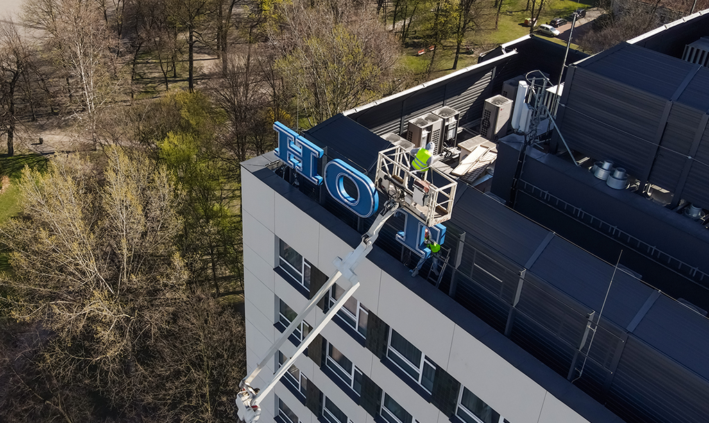
Installation of the Hotel Katowice neon using a high-reach crane

Installation on the rooftop: the city’s largest stage


Installing such a large neon in the center of Katowice required exceptional precision and specialized equipment. The letters, stretching over thirty meters, were mounted using a crane with an extended boom — the only one available in the city capable of reaching such height.

Each movement had to be perfectly aligned so that the entire sign would form a straight line and be visible in the city skyline exactly as it once was. When we performed the first lighting tests at dusk, it became clear that the neon had returned to the city in full form — as if it had never gone dark.


A symbol that lives again


Today, the Hotel Katowice neon lights up the rooftop once more and catches the eye just as it did decades ago. It appears familiar, yet behind its glow stands modern technology, a solid structure, and craftsmanship that will allow it to shine for many years to come.

This project not only recreates history — it preserves it. It is not a reconstruction, but a continuation of a symbol that has belonged to the city for generations.

2025.12.02

PRETENDE

Page 2 with 2 - Tag: Implementation | Blog | Pretende - Producer of illuminated advertising letters | Illuminated advertising specialists metal letters sheet metal letters