Blog

Home page / Blog


Building signage system (wayfinding) - how to design it to work in practice.

In many projects, signage is created as a collection of individual elements—boards, arrows, numbers, or logos. Each of them is designed separately, often by different people and at different stages of the investment. In the end, everything is assembled and installed in the space. From a design perspective, everything seems correct. The problem only begins when the user has to make their first decision.

A building signage system is not a set of elements. It is an information structure that should guide the user through the space without stopping them or forcing interpretation. The moment a person has to stop and think, the system stops working.

Movement through a building is based on simple decisions

The user does not analyze signage as a whole. They enter the building, look around, and search for the simplest path. They do not read every message, do not memorize information in advance, and do not build a mental map of the space. They make decisions at specific moments—where to go, whether to turn, whether they are on the right path.

If the space does not provide a clear answer exactly at that moment, the user stops. They start looking for confirmation, scanning the surroundings, going back. If the user has to stop, the signage is no longer working—it is only pretending to work.

signage – signage

Where chaos in signage comes from

Chaos does not result from a single mistake. It appears when signage is not treated as a system, but as a set of elements.

Most often, it comes from recurring patterns:

1. Signage designed at the end of the project
Instead of being part of the building concept, it tries to adapt to a finished space and its limitations.

2. Lack of analysis of user movement
The system does not respond to real behaviors, only to design assumptions.

3. Lack of identification of decision points
Information appears in random places, not where the user actually needs to choose a direction.

4. Lack of information hierarchy
All messages have similar weight, forcing the user to decide what is important.

5. Lack of system structure
Each element works individually, but they do not create a continuous guidance flow.

6. No connection with architecture
If signage does not result from the space, the user stops trusting it and relies on intuition.

7. Separation of design, production, and implementation
Each stage is handled separately, and overall consistency becomes no one’s responsibility.

8. No preparation for change
Over time, additional boards, corrections, and notes appear. The system grows, but does not become clearer.

In each of these cases, the result is the same—the user is left alone with a decision they should not have to make. And that means the problem has not been solved, only shifted onto the user, the building manager, or the operational team. In practice, it returns as user questions, additional signage, post-installation corrections, and time spent by teams explaining the space instead of using it. That is the real cost of signage that was “correct on paper.”

signage – signage

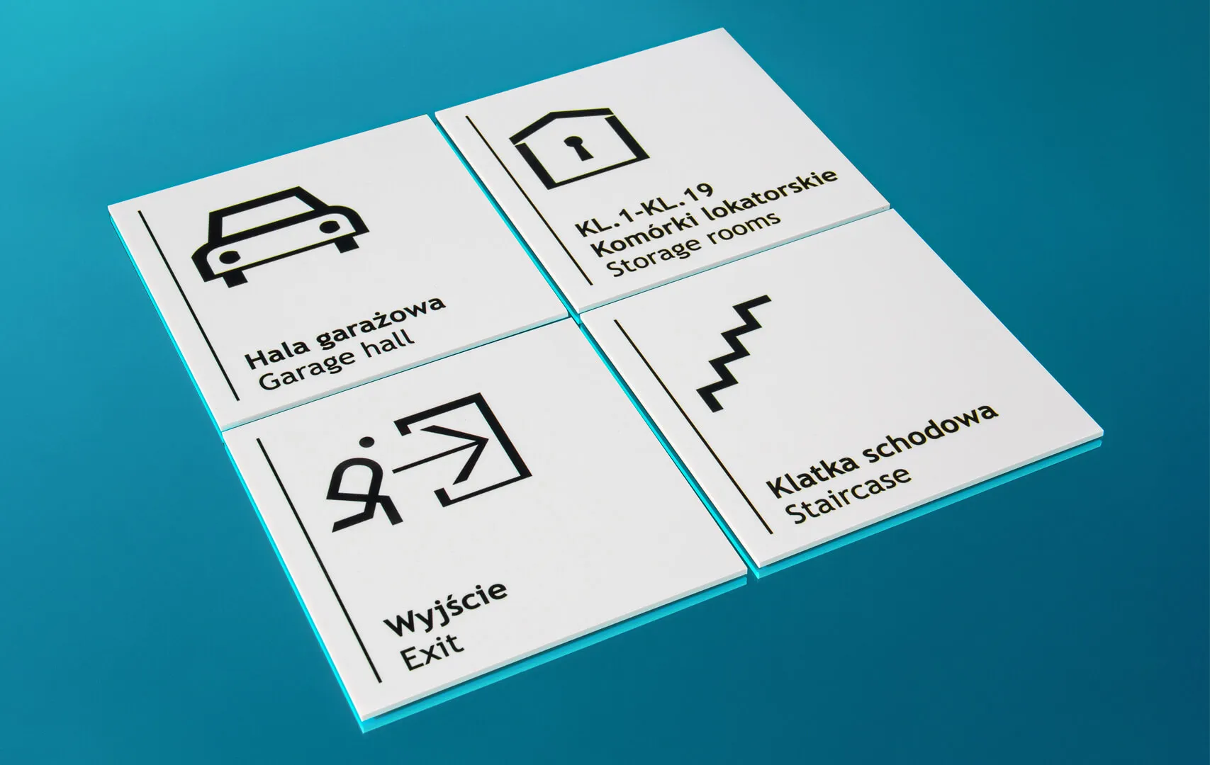
Signage as a system, not a collection of elements

Signage works only when it simplifies movement through space. It should not attract attention, but be obvious in use. A well-designed system does not require explanation. The user should not feel that they are using signage—they should feel that they simply know where to go. It is not individual boards that determine quality, but whether the whole works as one system.

Well-designed signage does not require management. Poorly designed signage becomes a constant operational problem. This is the moment when signage stops being an element of equipment and starts affecting how the entire building functions.

How to design signage that actually works

At the beginning, it is necessary to understand the space—its layout, movement directions, entry and exit points, and the moments where users make decisions. Based on this, the system logic is built: what the user needs to know, at what moment, and in what form.

Only then are the specific elements created. The system is defined much earlier—at the decision stage, not production. And this is the moment that is most often skipped in projects. That is why signage so often requires later corrections.

signage – signage

One responsibility instead of multiple contractors

In practice, the biggest problem is not design or production individually. The problem is their separation. When responsibility is divided, the problem does not disappear—it only changes ownership. The designer finishes at the concept stage. The contractor executes what they receive. Installation adapts to on-site conditions. And the system as a whole stops being anyone’s responsibility.

That is why signage is not something that can be effectively compared through quotes. Because what is being purchased is not boards—it is the way the space works. In projects that are meant to function, responsibility is not divided into stages. It is closed within one process—from decision, through design and technology, to production and installation. This ensures that signage does not require later “management”—it simply works. And that is exactly what determines whether the issue is closed or keeps coming back.

signage – signage

2026.04.02

PRETENDE

Realization of "CANADA" for Hockey Canada at Ice Palazzo | Milan 2026

We delivered large-scale illuminated “CANADA” letters for Hockey Canada, which became the central point of Ice Palazzo – the official space for Canadian athletes, their families, and guests during the Winter Olympic Games in Milan. This was not a decorative element. We created a spatial feature designed to operate under real conditions: intensive use, changing light, and constant presence of visitors. The letters were built as a monumental freestanding installation, precisely scaled to the interior and the dynamics of the event.

- The intense red color ensured immediate recognition of national identity.

- Uniform illumination provided stable and highly readable visibility – both in direct perception and in photography.

- The scale and proportions were designed to ensure visibility from a distance, while also creating a coherent background for close interaction and photos.

canada – canada

Natural meeting and photo point

At Ice Palazzo, the installation quickly became a natural stopping point – a place where guests approached, took photos, and returned to throughout the event. It functioned as a “selfie zone”, but not as a predefined decorative feature. This effect resulted directly from design decisions: scale, readability, and integration within the space. The photos created around this installation were not accidental – they were the outcome of signage that was intuitive and performed reliably in real event conditions.

canada – canada

Execution reliability

At Ice Palazzo, there is no room for on-site corrections. The entire structure was prepared as a stable, freestanding system designed for intensive use. Every element – from the structure and lighting system to finishing details – was aligned with one goal: to ensure consistent, reliable performance throughout the entire event.

canada – canada

Proven outcome

After completion, we received an official recommendation from Hockey Canada. The project proved its value in practice – it attracted attention, was actively used by guests, and operated without disruption throughout the event. This confirms that the installation not only looked right, but most importantly performed exactly as required in a space of this scale.

canada – canada

2026.03.27

PRETENDE

Light pollution in façade lighting - when light is out of bounds, it comes back as a problem

Light pollution originates at the decision stage, when light is treated as a product rather than part of a system. At that moment, the problem is built into the object.

Light operates every day after installation. If its direction is not defined, it extends beyond the façade into residential spaces and the users’ field of vision. It causes glare, reduces architectural clarity, and results in complaints and interventions in a finished object. This is a matter of controlling light emission and taking responsibility for the decision.

What is light pollution

Light pollution occurs when light does not remain on the object. It is not about quantity. It is about direction. Lack of control leads to emission beyond the intended area — light reaches the user, causes glare, and disrupts the perception of architecture. Instead of organizing space, it begins to disturb it. This involves two phenomena: glare and spill light. It is not a problem of fixtures. It is the absence of a decision about where light should end.

City – light pollution

Why the problem returns after completion

Lighting is treated as a final stage. Fixtures are selected and installed after the project is completed. If the decision was wrong, installation does not fix it — it only reveals the problem. Light is a constant emission. If it was not limited at the design stage, it remains in the object and requires later corrections. That is why the issue returns.

Market standard

Responsibility is divided. The designer, supplier, and contractor each handle their own scope, but no one is responsible for the final effect. In practice, the investor analyzes solutions, compares offers, and controls execution. And after completion, they return to the problem.

There are two scenarios:

  • single responsibility → the issue is resolved
  • divided responsibility → the problem returns

City – light pollution

PRETENDE: light control system

We treat lighting as a system for which we take full responsibility. The starting point is defining where the light should stop. Based on this, we define direction and eliminate emission beyond the object. Light is part of the structure, not an add-on.

Result:

  • light remains on the façade
  • it does not reach the user
  • no corrections are required after installation

Without a system, light escapes beyond the object and returns as a problem. With a system, it stays on the façade and the issue is closed. This solution is not for projects driven only by cost. It is for projects where mistakes create consequences.

Frequently asked questions

Is light pollution caused by excessive fixture power?

No. It results from a lack of control over the direction of emission.

Can it be fixed after installation?

Only through intervention in the object. That is why the decision must be made at the design stage. Light that was not controlled in the design phase returns as a problem after installation.

City – light pollution

2026.03.26

PRETENDE

Signage that matures - why engraved and cast signs don't lose meaning over time

In most buildings, signage comes back. At first, it looks good, but over time it begins to wear. After a few years, it no longer fits the place or requires replacement. This is not a coincidence, but the result of a decision made at the beginning. Signage can be designed either as a temporary element or as a solution that closes the topic for years — an engraved metal plaque belongs to the latter category.

Engraved metal plaque – engraving detail

Information that is part of the material

The difference is not in appearance, but in what the information actually is. In most signage, the content is a layer — print, film or application — placed on the surface and subject to wear over time. An engraved metal plaque works differently: the information is not an addition, but part of the material. It cannot peel off or wear away without damaging the whole, which is why it maintains readability and form for years, without the need for renewal.

Why signage comes back

The problem rarely lies in execution — it rather results from the assumption that signage will eventually require correction. Print always remains a layer, and every layer wears over time, which leads to replacement, fixes or another project. An engraved metal plaque eliminates this scenario from the very beginning: there is no element that “runs out” and no moment when the signage stops looking appropriate.

Engraving instead of print

This is not a matter of technology, but a decision about durability. Print works where content changes, but if it is meant to remain constant — it becomes a limitation. Engraving means that the content is embedded in the material, which is why it is used where signage must be clear, durable and unchanging. In some projects, bronze casting is also used (especially for monumental forms), but in most cases an engraved metal plaque remains the most universal solution.

Engraving on a metal plaque

A plaque as part of architecture

A well-designed plaque is not an addition — it is part of the place. On a building, in a hotel or a museum, it not only informs, but organizes the space and shapes its perception. In commemorative projects, it gains additional meaning and becomes an element of identity. Metal has a key characteristic here: it does not “visually wear out” in a typical way — it stabilizes, develops patina and gains character, which means that signage does not age, but matures.

When it is the right choice

Not every signage should be permanent — if the content changes, a replaceable solution is better. However, if the information is meant to remain constant (e.g. a building name, institutional marking, a plaque for a hotel or a museum), designing something temporary does not make sense. In such cases, an engraved metal plaque is a natural choice.

Engraving on a metal plaque

One decision instead of a series of fixes

Designing signage is not about choosing appearance, but about deciding whether the topic should return. If the material, proportions and readability are well designed, signage stops being an element to manage — it becomes part of architecture and simply works.

Signage that does not come back

A representative engraved metal plaque is not a solution “for now”. It is a choice for places that have their identity and do not want to redefine it every few years — a decision that signage will not come back as a problem.

Engraved metal plaque on a building facade

2026.03.17

PRETENDE

What are brand emblems and why top companies use metal signatures

In the world of premium brands, there is an unwritten rule: products that matter are signed. That signature is a brand emblem or a metal signature. It is a small element made of metal, often chrome-plated, polished or enamelled, which appears on a product, in architecture or within a brand environment.

It is not advertising or a graphic. It is a physical mark of quality that says one thing: this product has an author. That is why the best companies in the world use metal brand signatures — as a durable and elegant way to sign their products, projects and spaces.

Brand emblem – a physical form of visual identity

A brand emblem is a spatial marking most often made of metal or metal alloys that presents the company’s mark as a durable physical element.

Unlike printing or graphics, an emblem has structure, material and depth. Thanks to this, the brand mark stops being just an image and becomes a real object that can be seen, touched and remembered.

This is why emblems are often used in places where a brand wants to communicate quality through detail:

– on products
– on devices
– in building architecture
– in interior signage
– in equipment elements

In such projects, the emblem acts as a permanent element of visual identification that remains clear for years of use.

3D metal emblem with precise detail

Metal signature – a subtle brand signature

A metal signature is a special type of emblem. Its role is not to dominate the space but to sign a product or project in a subtle yet unmistakable way.

Just as an architect signs a building and a designer signs their project, premium brands use metal signatures as a mark of authenticity.

Most often these are small elements placed in discreet locations:

– on a product housing
– on a metal plate
– on an architectural structure
– in the corner of a piece of furniture or installation

Their size is small, but their importance in the perception of the brand is very large.

A well-designed signature communicates quality of workmanship, authenticity of the product, attention to detail and the presence of the brand in space.

Subtle metal brand signature on a product

Why the best companies use metal signatures

The best brands in the world know that trust is built through detail. That is why, instead of relying only on advertising, they invest in elements that strengthen the perception of quality in the real world. Metal emblems and signatures are one of those elements.

Durability
Metal markings are much more resistant than prints or stickers. They do not wear off, fade or lose their appearance for many years of use.

A material associated with quality
Metal has long been associated with durability, solidity and precision. Polished or chrome-plated surfaces give the marking an elegant and professional character.

Readability in space
3D emblems have depth and structure, which makes the brand mark readable in various lighting conditions.

Subtle branding
The best brands do not need to shout their logo. Often a small metal signature is enough to highlight the quality of a product or project.

Premium metal emblem with a polished surface

Materials used in metal emblems

Professional emblems are designed with durability and precision in mind. One of the materials often used in this type of production is zinc alloy, which allows extremely accurate reproduction of detail and form geometry.

Thanks to this it is possible to achieve:

– sharp edges
– precise spatial forms
– structural stability
– production repeatability

Depending on the project, emblems may be finished in various surface variants:

– polished
– satin
– matte
– chrome-plated
– gold-plated
– enamelled with colours

Such finishes allow depth, contrast and an elegant character of the marking to be achieved.

Various finishes of metal brand emblems

Emblem as part of brand strategy

In many projects the emblem plays a role much greater than simply marking a product. It becomes an element of the brand’s visual strategy.

A well-designed signature can appear in many places simultaneously:

– on products
– on architectural elements
– on space signage
– on equipment elements
– on commemorative materials

Thanks to this, the brand builds a consistent visual identification system that is recognisable in different contexts.

Emblems and signatures designed for brands

At PRETENDE, emblems and metal signatures are designed as individual elements of visual identification. Each project is created from scratch — taking into account the character of the brand, the proportions of the form and the place of exposure.

The process includes:

– analysis of visual identity
– spatial form design
– selection of materials and finishes
– preparation of production documentation
– quality control of execution

This approach allows the creation of 3D metal emblems that maintain aesthetics, durability and readability over a long period of use.

Production of metal brand emblems

Why detail determines brand perception

In the world of premium brands, the most important things are often not the biggest ones. The greatest importance lies in elements that are refined. Emblems and metal signatures belong precisely to such details. They do not dominate the space and do not attract attention through aggressive form.

But when someone notices them, it immediately becomes clear that the brand has been designed consciously. And that is exactly why in many industries the metal signature has become a standard of quality used by the best brands.

Metal brand detail as a subtle product signature

2026.03.16

PRETENDE

Hotel Katowice – the return of the iconic neon in a new form

The Hotel Katowice neon was never just an ordinary sign. It was a symbol of an era — the characteristic blue glow above the city center and a visual element of the city’s identity that accompanied residents for decades. When the time came to revitalize the entire building, the investor faced a key decision: how to bring back a neon that everyone remembered, yet one that could no longer be restored? That was the moment when the Pretende team stepped in.


Dismantled fragment of the old Hotel Katowice neon sign before reconstruction

When history meets reality


Despite its cultural value, the old neon had no chance of a second life. The metal sheeting crumbled in our hands, the structure was eaten by rust, and the glass tubes were cracked and incomplete. Technically, it was impossible to save it in a way that would meet modern safety standards and deliver the quality expected by the investor.

This was not meant to be a simple renovation. It was about preserving the spirit of Katowice. That’s why we decided to recreate the structure from scratch — maintaining full fidelity to the original, centimeter by centimeter.


Newly recreated Hotel Katowice neon installed on the rooftop

Recreation in a 1:1 scale


In Pretende’s workshops and laboratories, a neon was created that is both new and deeply familiar to all residents. Every letter was reproduced exactly as in the original — preserving proportions, angles, characteristic curves, and the routing of the neon glass along the outline.

The color was crucial. The iconic blue shade that lit up the Katowice skyline for decades was recreated through a digital pigment analysis. The result? A blue tone that looks exactly like it used to — only clearer and more saturated.


New construction of HOTEL KATOWICE neon letters during production

Modern materials, classic soul


Although the visual effect recalls the past, the new structure was built from materials ensuring durability for decades. The aluminum letters — about 1.5 meters tall — are corrosion-resistant and stable even in strong winds. The painting process took place in our workshop, where the letters filled the entire working area; two layers of coating were applied to withstand weather conditions and retain color intensity over time.

The greatest artisanal challenge was the neon glass. It was hand-bent by a master craftsman with 35 years of experience, using classical techniques rarely seen today. Thanks to this, the neon preserved its characteristic lightness, rhythm, and the unique glow that LEDs simply cannot replicate.


Installation of the Hotel Katowice neon using a high-reach crane

Installation on the rooftop: the city’s largest stage


Installing such a large neon in the center of Katowice required exceptional precision and specialized equipment. The letters, stretching over thirty meters, were mounted using a crane with an extended boom — the only one available in the city capable of reaching such height.

Each movement had to be perfectly aligned so that the entire sign would form a straight line and be visible in the city skyline exactly as it once was. When we performed the first lighting tests at dusk, it became clear that the neon had returned to the city in full form — as if it had never gone dark.


A symbol that lives again


Today, the Hotel Katowice neon lights up the rooftop once more and catches the eye just as it did decades ago. It appears familiar, yet behind its glow stands modern technology, a solid structure, and craftsmanship that will allow it to shine for many years to come.

This project not only recreates history — it preserves it. It is not a reconstruction, but a continuation of a symbol that has belonged to the city for generations.

2025.12.02

PRETENDE

The Rust Myth – Why Large-Format Corten Letters Are Truly Unique?

At first glance, corten steel may look like ordinary metal covered with rust. This is only an illusion — corten creates its own natural shield: patina. This variable and unique layer makes large-format corten letters and oversized corten signage one of a kind, perfectly suited for marking buildings, hotels, restaurants, and public spaces.


A patina that tells a story

Each 3D corten letter has a unique surface pattern — from golden tones, through intense rust-red, to deep brown. It is not paint but a long-lasting process that develops over time. That is why monumental corten letters are never copies, but original works created by both nature and architecture.


Rust? Or protection?

The word “rust” usually suggests decay. With corten, it’s the opposite — the patina acts as a natural protective layer. That is why large-format corten letters not only maintain their durability but also gain depth and character, making them a perfect choice for XXL signage and decorative letters in urban spaces.


Why choose corten letters?

The evolving appearance goes hand in hand with timeless form. Every project is unique, and its expressiveness grows with age. It’s a solution that cannot be ignored, practical and resistant to weather conditions.


Corten as a symbol of place

Large-format corten steel letters are more than just signs. They are architectural accents that build the identity of a space — from facades and entrances to squares and courtyards. Their strength lies in natural variability: they never look the same and mature together with their surroundings.


Large-format corten letters combine the durability of steel with the beauty of natural patina. They are not only signage but also art in public space — unique, noble, and memorable.

If you are looking for a solution that emphasizes the character of a place, attracts attention, and evolves with architecture — corten letters are an absolutely exceptional choice.

2025.10.02

PRETENDE

Infinity Mirror – An Endless Play of Light and Form

There are installations that catch the eye… and then there are those that completely capture your attention. Infinity mirror belongs to the latter group. It is an illusion in which light seems to disappear into infinity, creating a mesmerizing tunnel – even though, in reality, it fits into a structure only a few centimeters thick.

The secret of the illusion

The effect is achieved by combining an optical mirror with perfect reflection clarity and a semi-transparent reflective glass. Between them works a precise LED lighting system, programmable to create smooth color transitions, geometric patterns, or dynamic animations.

The light reflects multiple times, with each reflection becoming softer – creating the illusion of infinite depth. Our brain interprets it as an open portal to another dimension, where light moves to its own rhythm.

More than light

Infinity mirror can become more than just a “window into infinity.” With the right configuration, it is possible to incorporate holographic elements that appear to float within the tunnel. This could be a three-dimensional logo, an abstract form, or even an animated projection that changes over time.

Infinite shape possibilities

The infinity mirror structure does not have to be a rectangular frame. It can take any shape – from a perfect circle, through waves and polygons, to complex forms inspired by a logo or unique artistic design. The only limit is imagination – the light tunnel can be given a look of classic elegance or a futuristic, sculptural form.

Precision craftsmanship

The entire structure is made from high-quality anodized aluminum, stainless steel with a satin or mirror finish, and tempered optical glass with hand-polished edges. Every element is refined to ensure a pure, deep effect that impresses from every perspective.

2025.08.14

PRETENDE

Light, Style and Art. The Story of a Neon for “Tamara Łempicka” at the National Museum in Krakow

This project was more than just a technical task from the very beginning. From the moment the National Museum in Kraków invited us to collaborate, we knew it would be a challenge combining craftsmanship, design, and art. The goal was to create a neon that would greet visitors to the exhibition dedicated to Tamara Łempicka — an icon of Art Deco style.

Our first thought? “This sign must capture the energy and brilliance of her paintings!”


Letters that draw you into the story

Imagine a dark corridor leading to the exhibition hall. Before you see a single work by Łempicka, a glowing sign greets you. Instantly, you know you are entering a world full of elegance and character. We wanted each letter to live and breathe, so we designed a two-part composition: “TAMARA ŁEMPICKA”.

Hand-bent glass tubes, warm white light, and subtle pulsation ensure the sign doesn’t overwhelm but emerges from the darkness like the first confident brushstroke on a black canvas.


A subtle nod to Art Deco

Slender, geometric letters are our tribute to the era Łempicka helped shape. Precise lines guide the eye exactly where it should go, with proportions and rhythm inspired by her signature diagonal compositions.


Installation in the heart of the exhibition

The neon was mounted on a black backing that blends seamlessly with the wall. The viewer sees only pure typography in fiery glass, while all the technical elements — wires, fixings, transformer — remain hidden. The intention was for visitors to feel the light itself, not its construction.


From concept to first spark

Technically, everything worked flawlessly. But what brings us the most pride is becoming part of a larger story — about an artist who could combine sensuality with precision in a single brushstroke.

We thank the National Museum for their trust, and Tamara Łempicka for the inspiration. Because light can tell stories as beautifully as art itself.

2025.08.13

PRETENDE

LED Neons: Acrylic LED Neon VS Flex LED Neon

Classic glass neon signs – gas-filled, full of noble nostalgia and characteristic light – have ruled the streets for years. They still impress with their charm. But the world changes, and so do our needs. Not everyone can afford the delicacy of a glass tube, especially in lively spaces like food trucks, festivals, or dynamic retail and hospitality settings. In such places, we start looking for alternatives. That’s how LED neons were born – durable, flexible, and just as eye-catching.

But “LED neon” is too broad a term today. In reality, we are talking about two entirely different worlds: acrylic LED neons and flex LED neons. Although they may look similar at first glance, the difference in craftsmanship, durability, and aesthetics is vast and hard to ignore.

How are they made?


Acrylic LED neons use an impressive technology: we start by precisely milling shapes from acrylic – letters, icons, symbols, even the tiniest details. Then we fill them with LED light – high quality, even, soft. The result? Perfectly clean edges, depth, and precise project reproduction. You can also choose where the light goes – front, side, back, or all around. Play with color – RGB, RGBW, transitions, halo effects. This gives the designer full control.

And flex neon? Well, it’s simply a flexible LED strip embedded in silicone. Its only real advantage – you can bend and install it quickly. But only if you don’t expect much. The strip can’t handle tight curves or fine details and always ends up simplified. It looks bulkier, less precise, and with less “wow.” As a commercial neon – flex doesn’t hold up in daylight (literally or figuratively). In professional spaces, it just looks cheap.

Durability and light quality: a gap between technologies


The acrylic neon’s strength lies in accurate shapes – refined, clean-cut letters and symbols. Durability? Unmatched. Acrylic resists impacts, doesn’t break like glass, and – importantly – it’s not flexible like flex. Its rigidity is a major advantage: acrylic neon is solid, stable, and doesn’t bend or deform under temperature changes.

Acrylic also acts as a light diffuser. This means letters and logos are illuminated smoothly and evenly – easy on the eyes. The light is soft and natural – comfortable even at close range.

Flex neons are the opposite. The silicone used doesn’t diffuse light evenly – especially blue tones become harsh and irritating. It strains the eyes and ruins the visual appeal.

What’s more, flex neon is unreliable – it’s made from cheap roll LED strips. Connections short, LEDs burn out. White flex turns pink, then dies. Dark spots appear – ugly up close.

From afar? Still bad – the glow is harsh and artificial, letters blur together, readability drops.

End result: what makes the difference


Acrylic LED neons simply look professional. With flame-polished surfaces, they shine and feel refined. The result is premium – evoking both elegant glass neon and luxurious 3D lettering. A branding upgrade.

Flex? Just a bent tube – often cut with a knife, glued by hand, full of imperfections. Far from professional. Not suitable for premium projects. Doesn’t inspire.

To sum up: not every glowing line is a neon


Sure, LED neon tape has its place – it’s cheap, quick, and decorative. But if you want more – quality, durability, standout aesthetics – acrylic LED neons have no rival.

This is next-gen lighting: combining modern tech with elegance. If you want your space to truly stand out – choose the solution that deserves it.

2025.07.17

PRETENDE

STAY
WITH US

JOIN PRETENDE INSIDER

Information on projects available exclusively to the PRETENDE Insider group - in advance of the market.