
1.
SYSTEMIC BUILDING SIGNAGE
AND WAYFINDING
ONE RESPONSIBILITY
FROM DESIGN TO THE FINAL RESULT
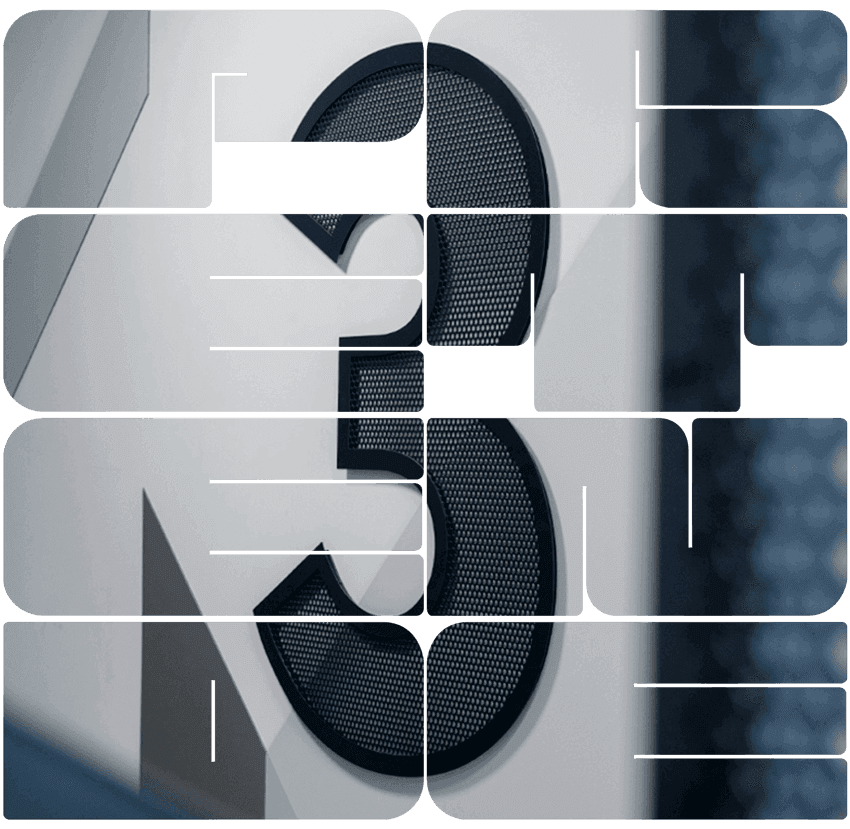
- Building numbering, room signage
- Directional signs, information boards
- Logo plates, pictograms, directional signage
- Identification of flats, staircases, garage halls
- Glass surface coverings
PRETENDE is the only Polish company in the signage and advertising letters industry that has established a long-term, membership-based cooperation with ISA – the International Sign Association. Membership in ISA provides us with access to international know-how, quality standards, and proven practices of global signage system manufacturers.
For clients, this means projects delivered based on verified solutions, up-to-date industry knowledge, and international standards – with full control of key project risks. PRETENDE assumes full responsibility for the project: from concept, through production, to installation, ensuring stability, repeatable quality, and peace of mind for the investor.

.png&w=3840&q=90)
.png&w=3840&q=90)
LED VIDEO DISPLAY LETTERS
- Fixed letter form
- Dynamic video content
- Single point of responsibility

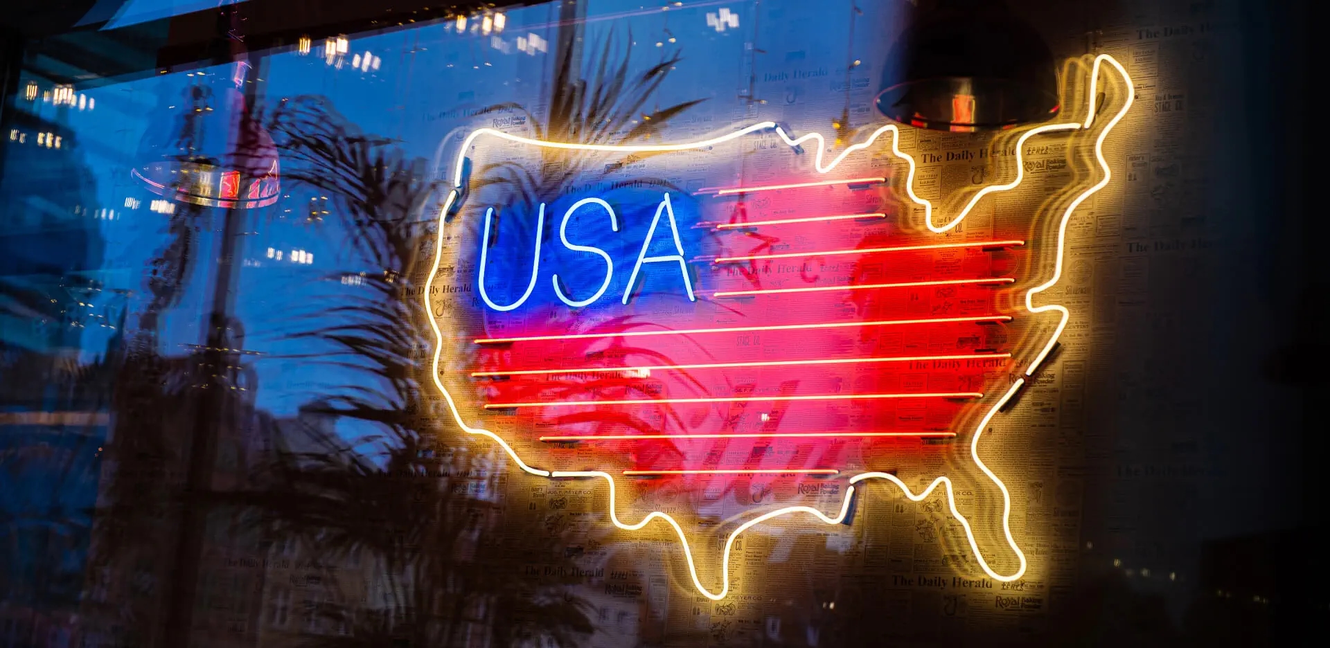
NEONS
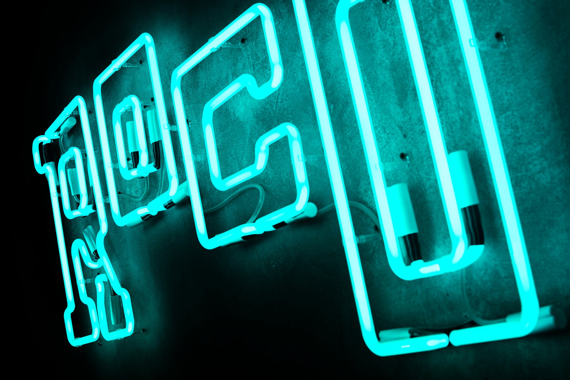
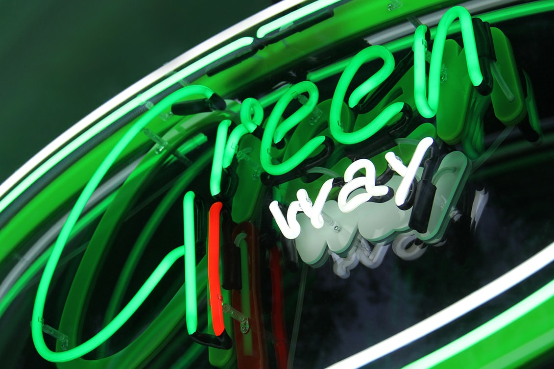
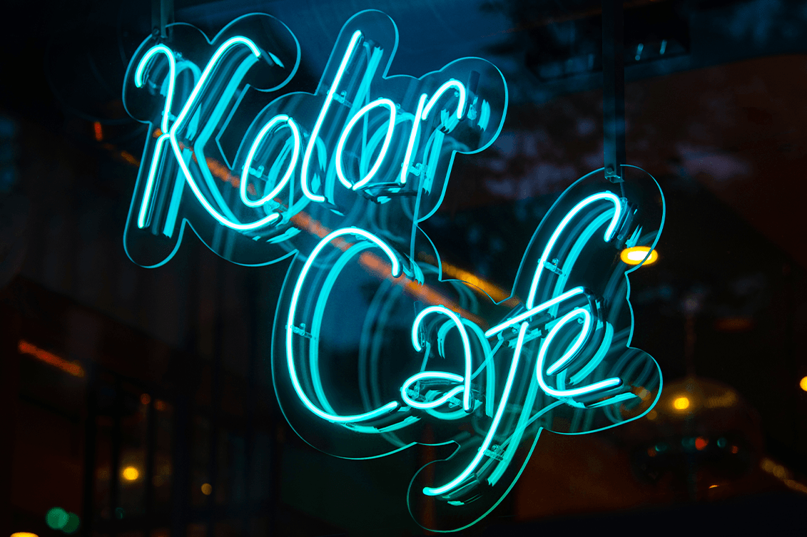
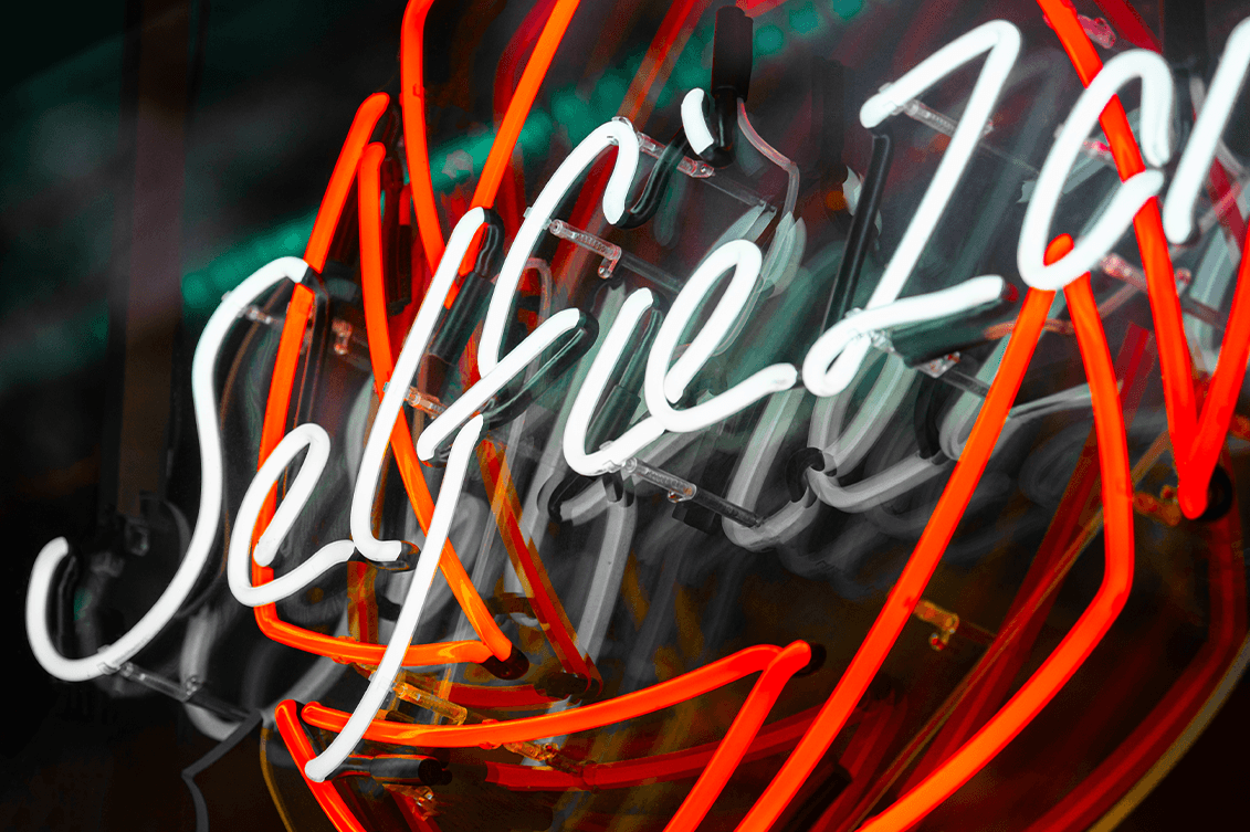
PRETENDE neon signs are custom-designed, durable lighting signage systems delivered through a single, closed process — from site analysis and viewing conditions, through design and production, to installation. They are not catalogue products or decorative items; each neon is created individually, based on the building’s architecture, viewing scale, and long-term use.
PRETENDE takes full responsibility for the final result — including technology, legibility, durability, and installation — eliminating design, production, and service risks. The client does not coordinate contractors or make technical decisions.
The neon is purchased once and operates for years — with no subscriptions, recurring fees, or hidden costs.
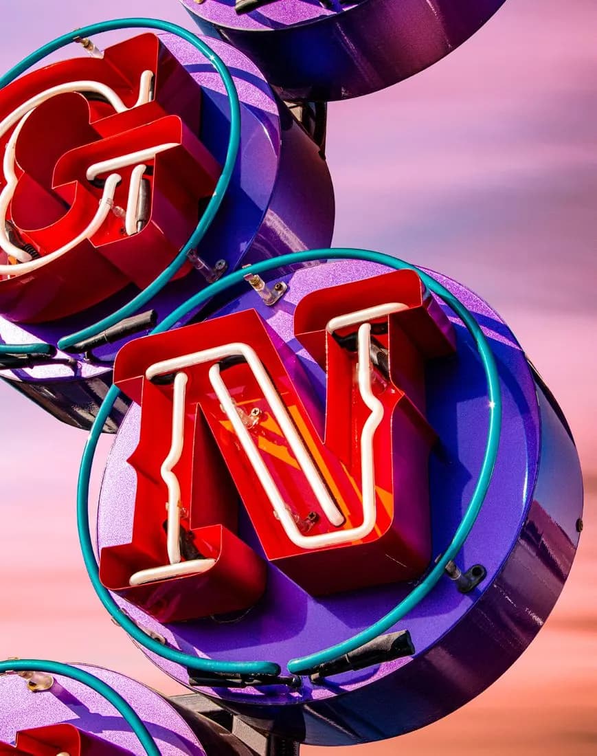
LETTERS WITH BULBS
Permanent, three-dimensional signage designed as part of the architecture — not seasonal advertising.
Used where character and clear identification matter: hospitality, hotels, public spaces, and commercial buildings.
Each project is delivered within a single, closed process: form concept, selection of light sources and structure, production, testing, installation. One responsibility. One cohesive final result, designed for the real conditions of a specific location.


Mirror
infinities
An architectural Infinity Mirror lighting installation, designed and delivered by PRETENDE within a single, closed process:
site analysis, design, production, installation, predictable result.
One-time investment. No recurring fees.
Acrylic
LED
Neon
Custom-designed lighting signage systems made of solid acrylic, delivered by PRETENDE within a single, closed process: design, production, installation. Responsibility for the final result applies exclusively within the scope of the approved design and the installation conditions specified therein. Any change to installation conditions requires a new technical assessment. A one-time investment. No recurring fees. A system designed for long-term, stable operation — without loss of visual effect over time.
LUMINOUS LETTERS
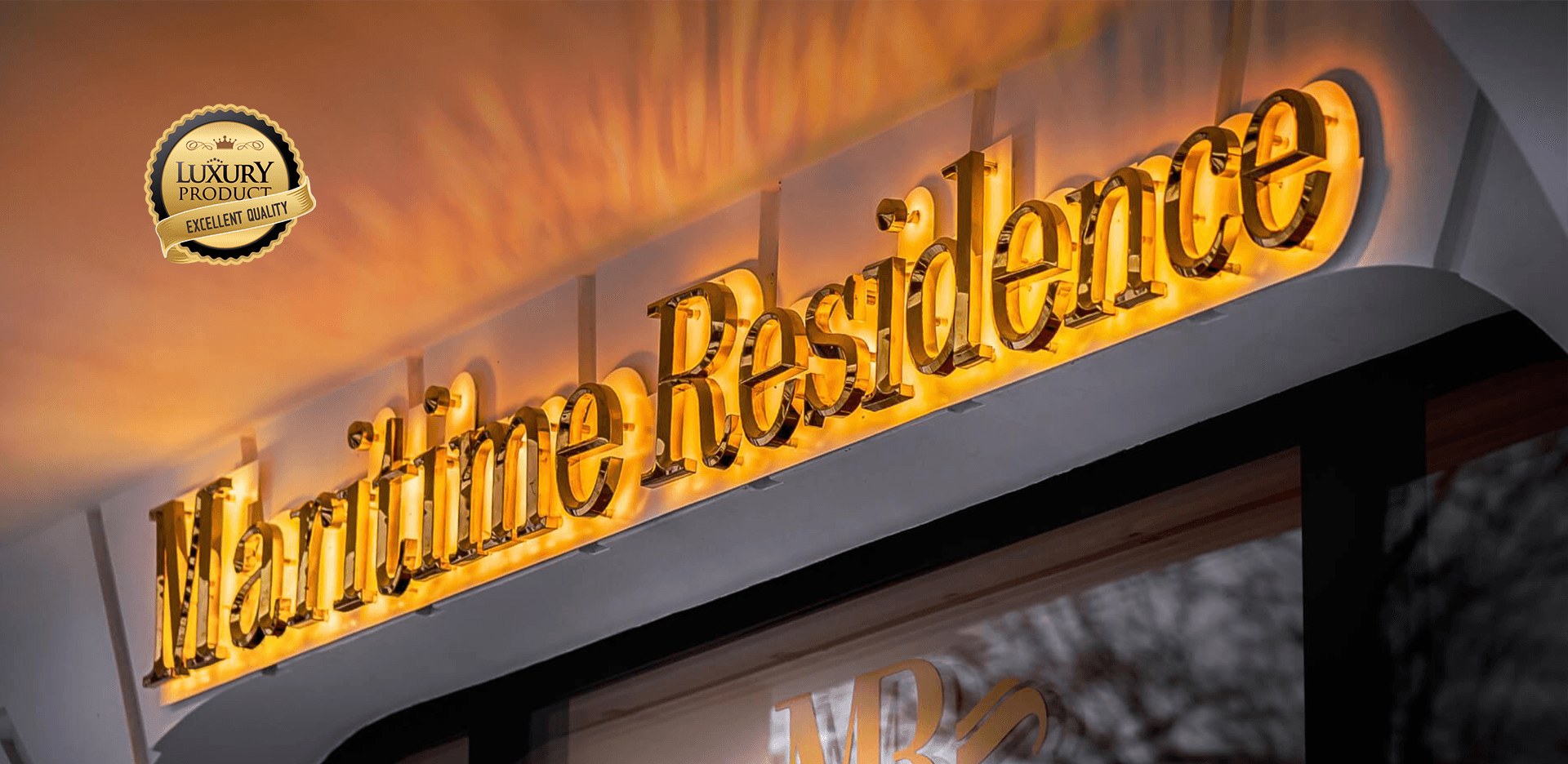
PRETENDE illuminated letters are architectural signage designed and implemented in a single process, with the selection of form, technology and light based on the viewing conditions and function of the sign. We design them as a permanent element of architecture and visual information system - legible during the day and after dark. If the light does not provide the right informational or architectural effect, we recommend an alternative solution.


METAL SHEET LETTERS AS A FORM OF REPRESENTATION
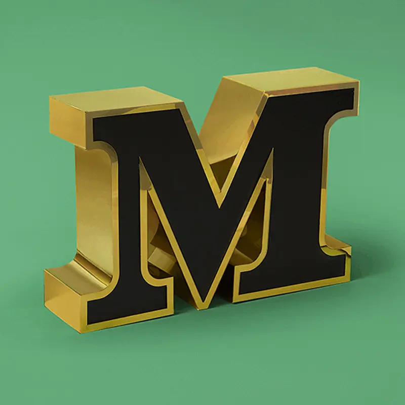
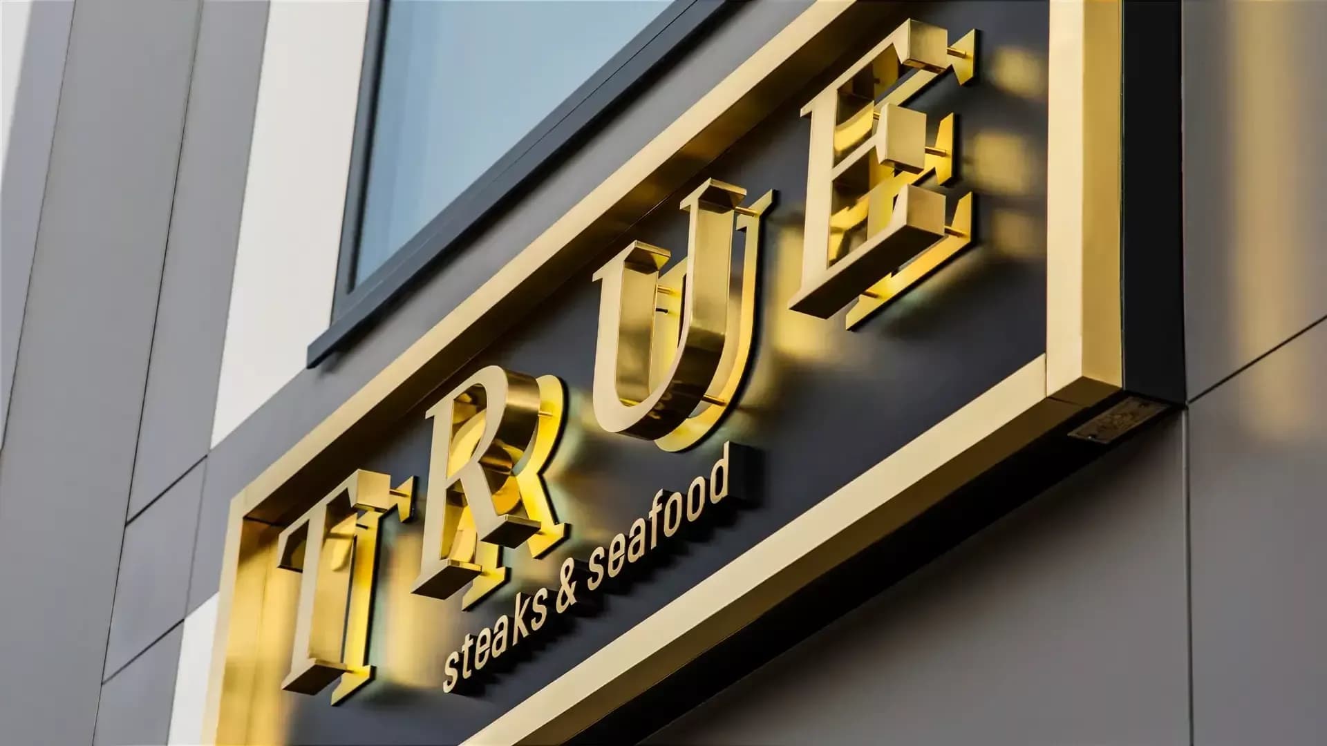
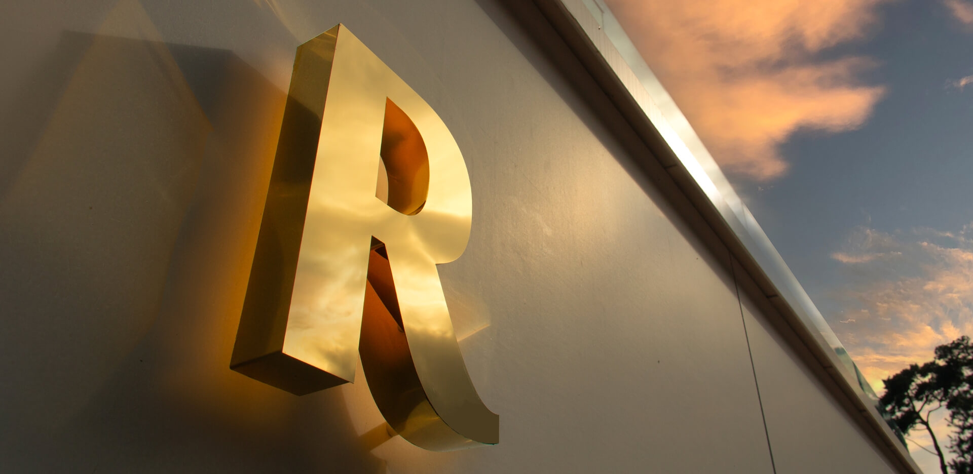
Metal sheet in signage does not serve as a decorative addition. It is the structural foundation of the sign — especially in façade signage and metal letters designed for long-term use. It determines durability, formal precision, and legibility over time. Steel and titanium sheet letters used in architectural signage are created as autonomous objects — with full control over proportions, edges, and finishes. As a result, the form remains clear, visually stable, and resistant to changing conditions and surroundings.
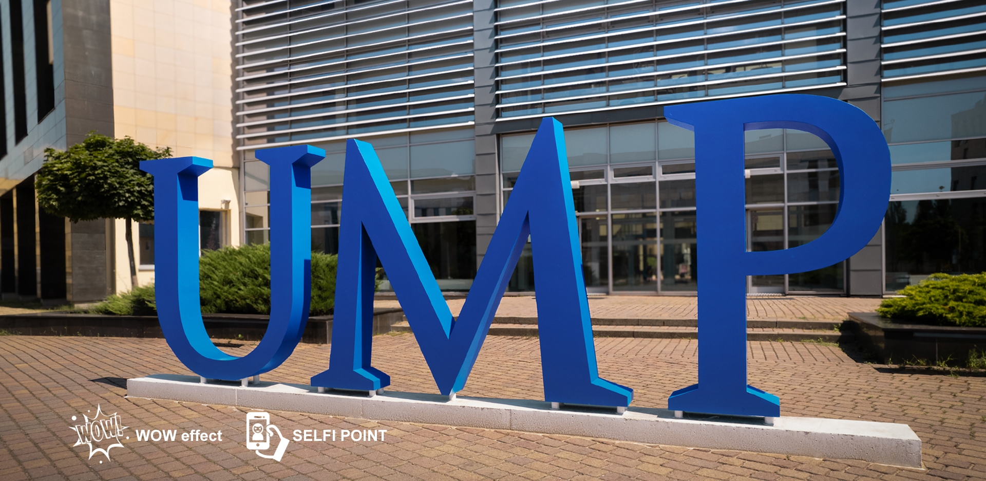
A SCALE THAT DOMINATES SPACE
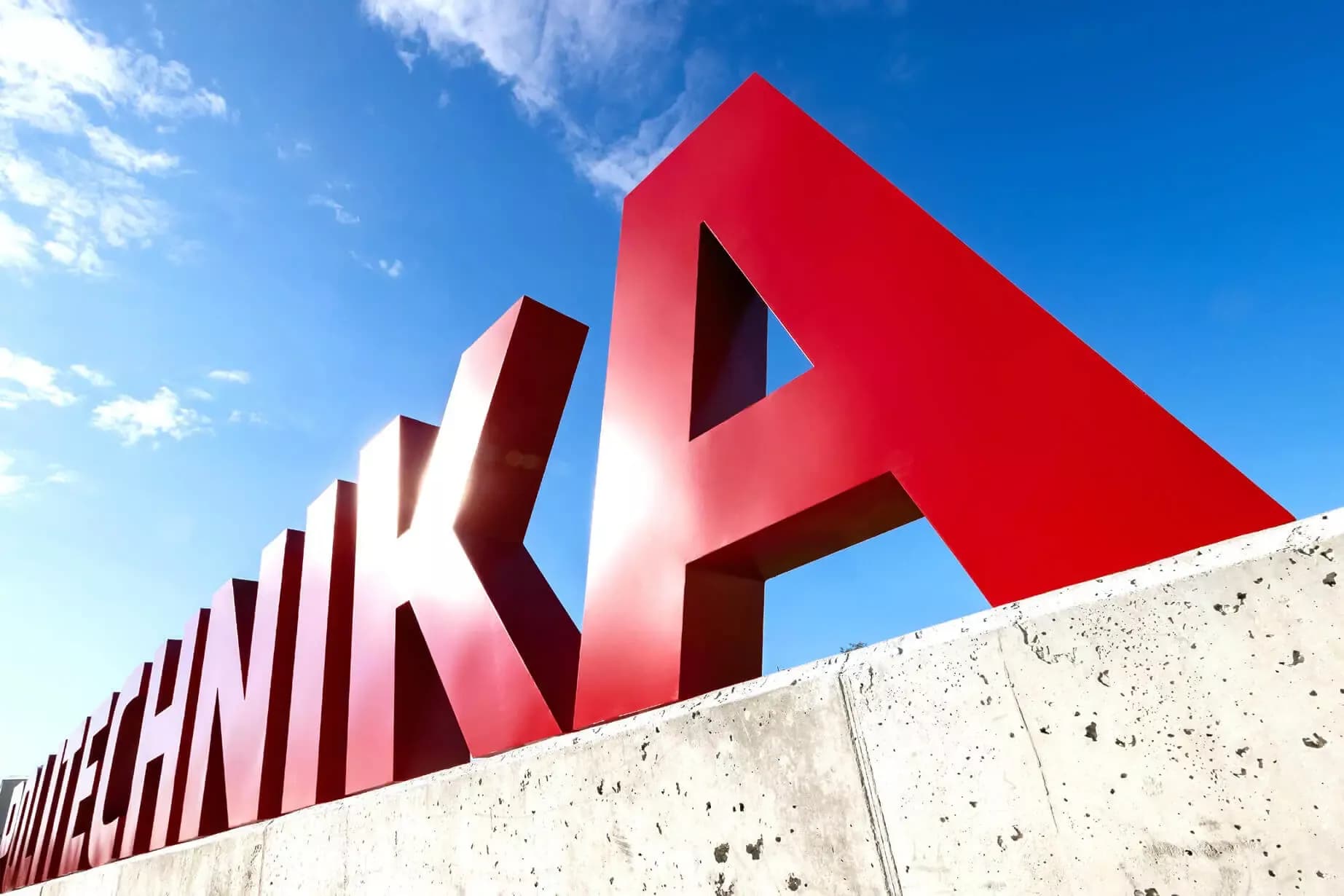
Large-scale freestanding letters are not decoration.
They are a decision about how a facility asserts its presence in space and from what distance it remains legible.
Permanently installed large 3D forms organize the surroundings, support orientation, and establish a clear reference point. They are effective wherever long-distance visibility and an unambiguous message matter.
Each realization is created as an autonomous architectural object — with full control over proportions and structure.
RAW FORM. REAL METAL.
Metal letters and signage are designed as integral elements of architecture — not as an aesthetic add-on. Material, thickness, and finish are selected according to location, scale, and function, rather than a temporary visual effect. We create metal letters and signs with a clear industrial character — where form and proportion organize space and legibility remains unquestionable. Every project is treated as an autonomous object: from formal decisions, through manufacturing technology, to installation and how the material performs over time, not only on the day of delivery.
VISIBILITY THAT GUIDES
Freestanding signage is a system of spatial information whose purpose is
clear user orientation already from a distance — without the need for additional decisions.
Pylons, totems, and directional systems are designed as the first point of orientation of a facility, not as advertising media.
Their role is to organize space, guide movement, and reduce uncertainty already at the first contact with the place.
Form, scale, and light work here for legibility and orientation — not for a temporary visual effect. Each project is treated
as an element of a coherent information system. We analyze the location and viewing distance, design the structure and
lighting technology, and then carry out installation with long-term stability and legibility in mind.
PRETENDE takes responsibility for the legibility of the system as a whole — from the first point of orientation
to the consistent reception of information in space.
THREE-DIMENSIONAL LETTERS AND LOGOTYPES THAT COMPLETE THE SIGNAGE SYSTEM
Interior signage is not a matter of form or material.
It is a decision about clarity, order, and spatial understanding — without corrections or returning to the topic after installation.
We design letters and logotypes as a system of spatial information, not as decoration. They guide users, organize space, and clearly identify the place.
At PRETENDE, we deliver this through a single, closed process — from design decisions to the final result — taking full responsibility for the legibility and durability of the signage.

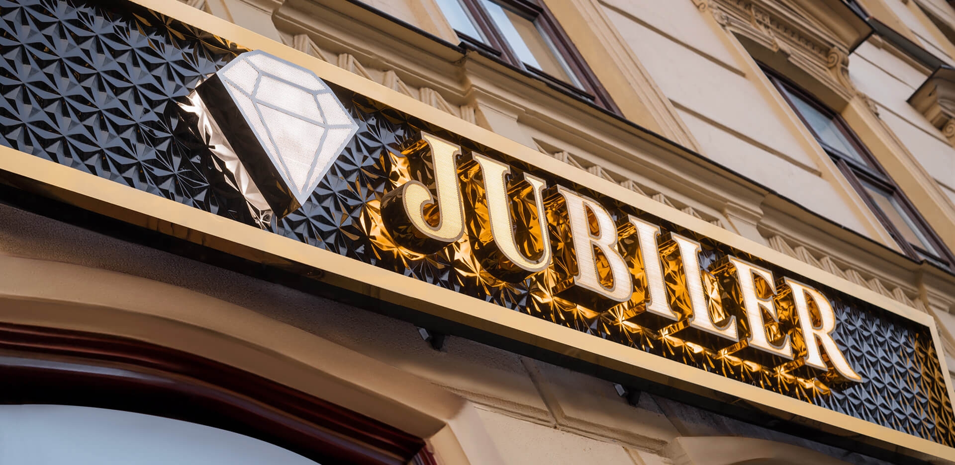
PRISMATIC LETTERS AND LOGOTYPES
A form that organizes space with light and geometry
Prismatic letters are three-dimensional identification signs in which the geometry of the sides works as intensively as the front. Broken planes build depth, light and shadow, and reflections, allowing the sign to remain legible and expressive from different directions — also under changing lighting conditions.
This is not decoration.
It is a consciously designed spatial form whose purpose is to strengthen orientation, hierarchy, and the presence of the brand within architecture.
Prismatic letters function as part of an identification system — the form not only attracts attention, but also organizes spatial perception and closes the topic of signage for years.
We are the guardians of order and calm – one responsibility from decision to the final result.

EMBLEMS AND SIGNATURES
Global brands that chose the Pretende standard

AMERICAN DREAM
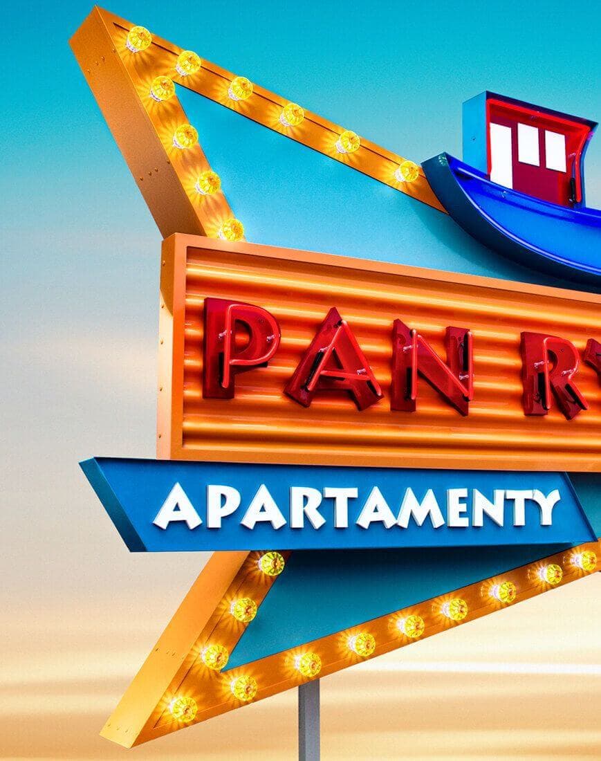
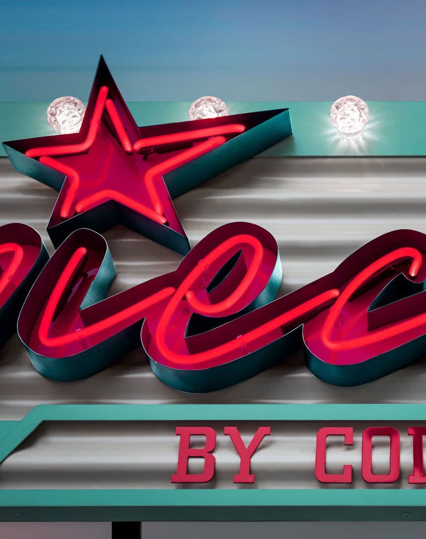
These are not decorations or nostalgic quotes from the past. They are contemporary signs inspired by classic American typography — designed and produced with real space, scale, and durability in mind. We draw from the visual language of motel signs, freestanding signage, and icons of American pop culture — the simplicity of the message, long-distance legibility, and the scale of the sign — realizing them within today’s standards of technology, execution, and responsibility for the final result. Each sign is handcrafted — from the design decision to the final form — as part of a visibility system meant to work over time, not just look good at the moment of installation. This is not a vintage style. It is a contemporary interpretation of American sign simplicity — designed so that a decision made once does not return after a few seasons.
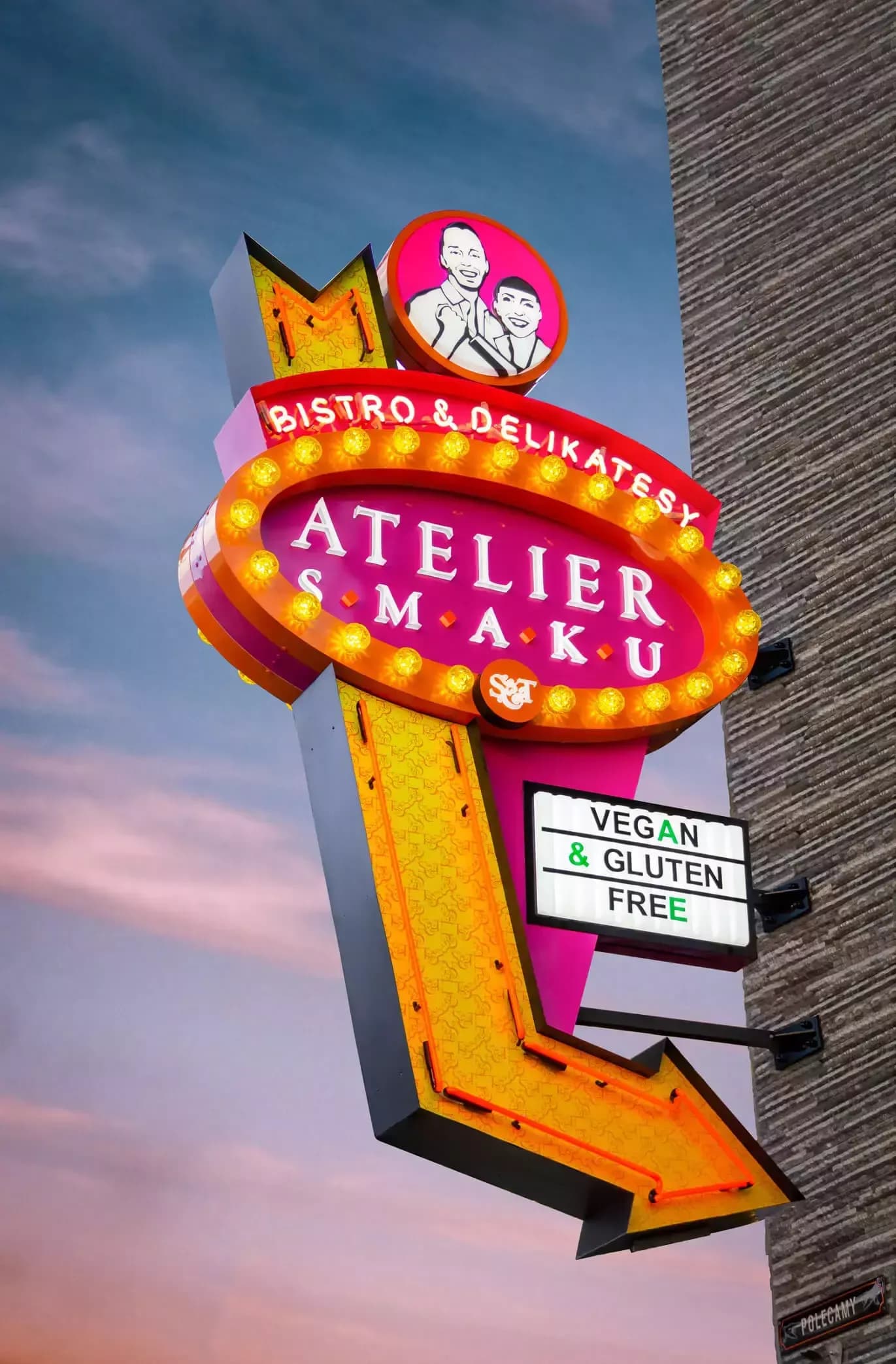
THEY MARK A NEW ERA OF VISIBILITY
SIMPLE. BOLD. DESIGNED TO LAST.
This is not a return to the past nor a play with vintage aesthetics. It is contemporary signage inspired by American typography — designed as a durable, clear sign within real architectural space. Form is not the goal here. It is a tool for organizing a building’s communication — from close up and from a distance, by day and after dark. Most signage solves appearance only for the moment. PRETENDE designs visibility systems that close the topic for years. This is not a style. It is a design decision that eliminates randomness, reduces risk, and lifts the burden from the decision-maker. Once made — it does not return after a season.



.jpg&w=3840&q=100)
.webp&w=3840&q=100)


